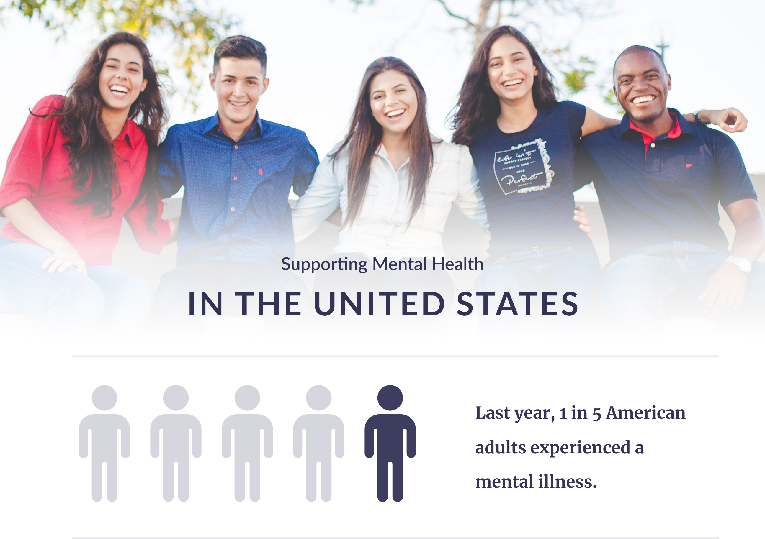
Today even though 40 million+ Americans suffer from mental health issues, navigating a mental health crisis remains a mess. Due to little awareness and stigma, knowing where to start is often a daunting experience.
In this situation, how can we support Americans better navigate a mental health crisis?

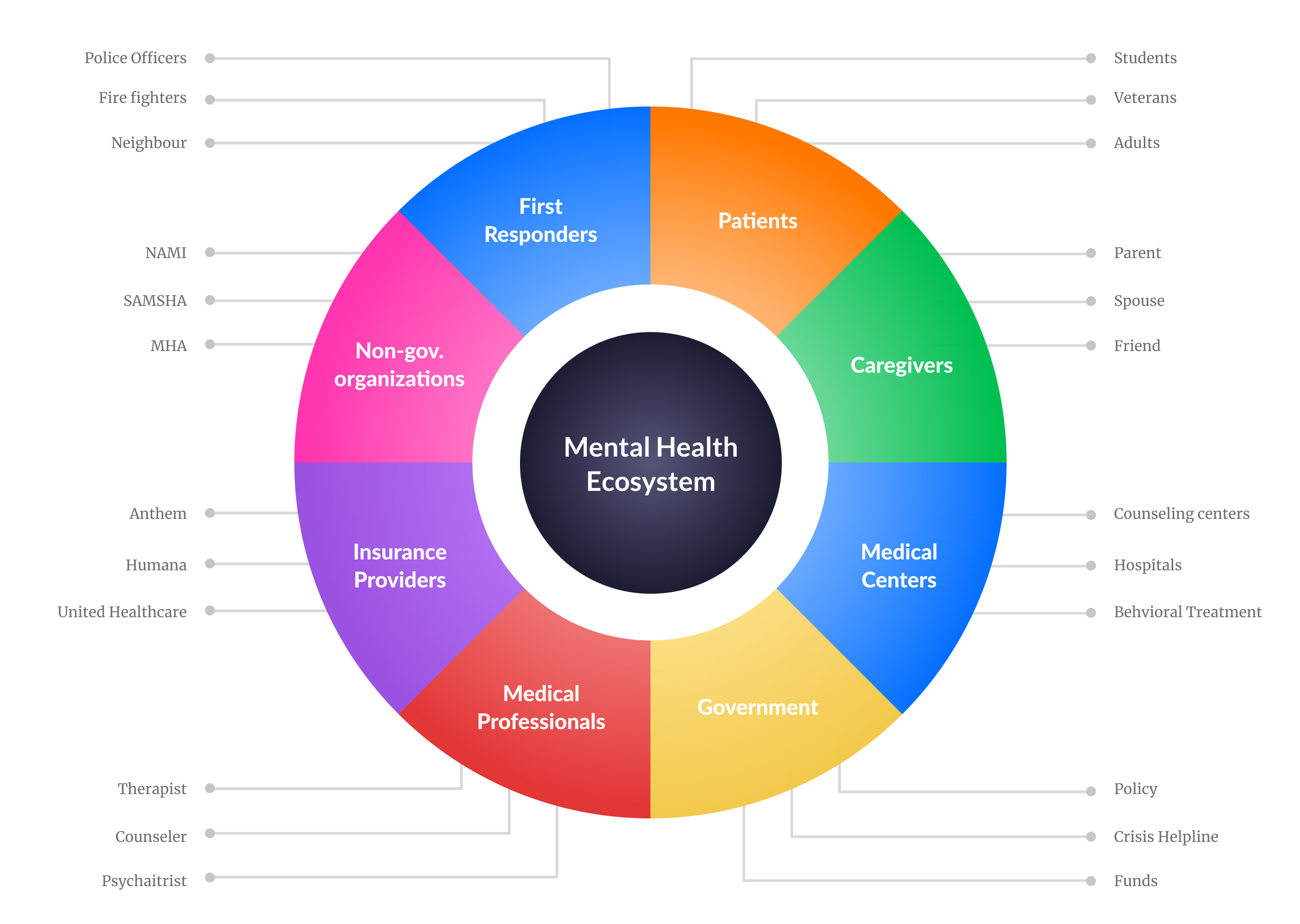
Mental Health Ecosystem
The challenge is huge. When we think of mental health ecosystem in the US several entities come into picture. They range from patients, caregivers, clinicians to government and insurance providers.
My Role
I worked on this project as a UX Designer alongside 2 UX researchers for a duration of 8 months. This project was collaboration between Georgia Tech and NAMI(National Alliance on Mental Illness), which is the largest grassroots organization for generating awareness on mental health issues.
The project was challenging and emphasized universal and accessible design practices.
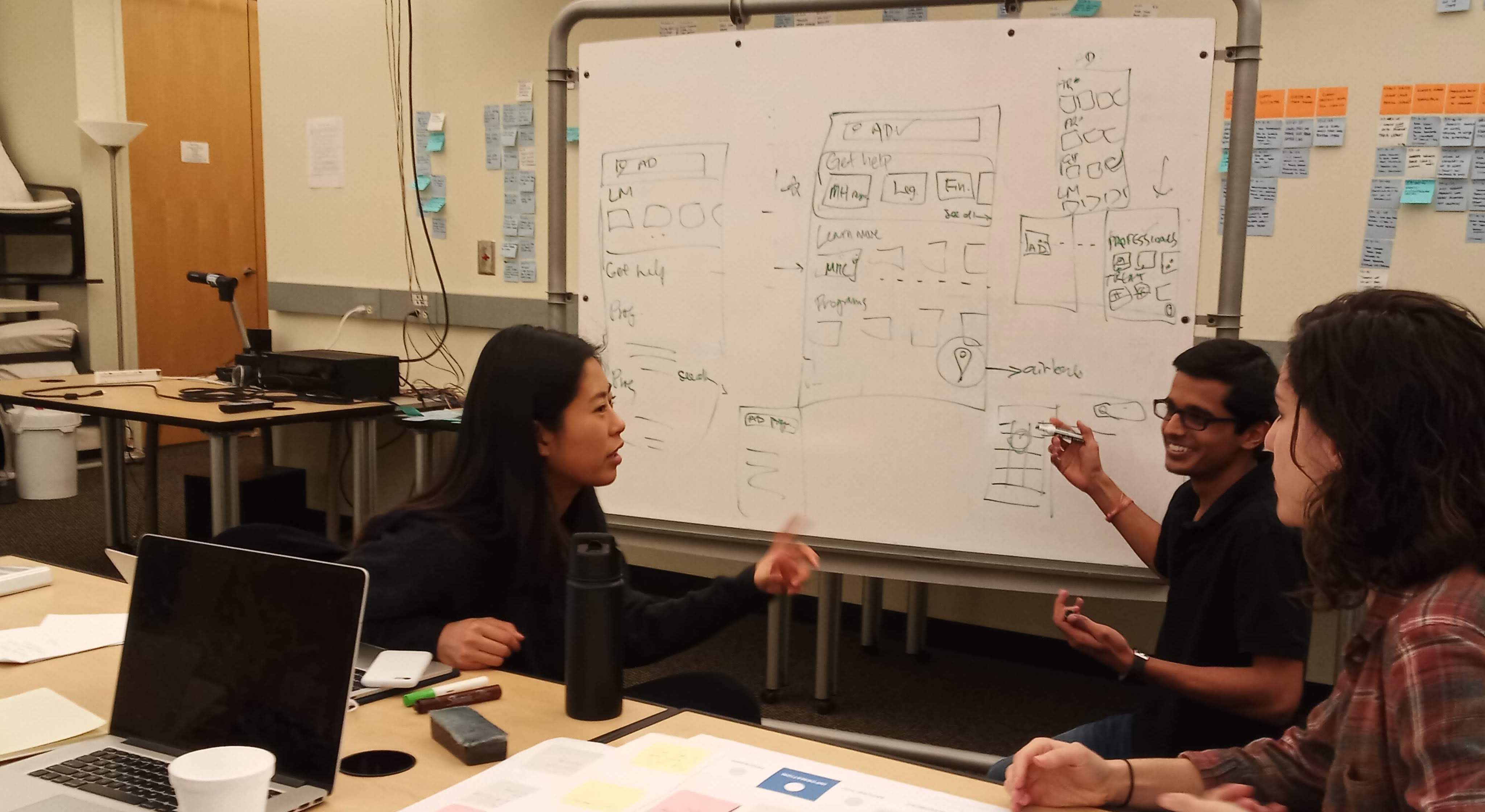
Brainstorming session with the team
Project Goal
As the project domain was huge, we met with the stakeholders to define a scope of the project. After discussion, we drafted our project goal.
Design a solution which can provide a single source of comprehensive local resources to:
1. Patients
2. Caregivers
3. First responders
Timeline
The project was spread over 2 semesters:
- First semster involved conducting research, developing a strategy, and getting feedback on the potential solution.
- Second semester, was refining the designs and stakeholder handoff for product development.

Phase 1
Research
Role of technology?
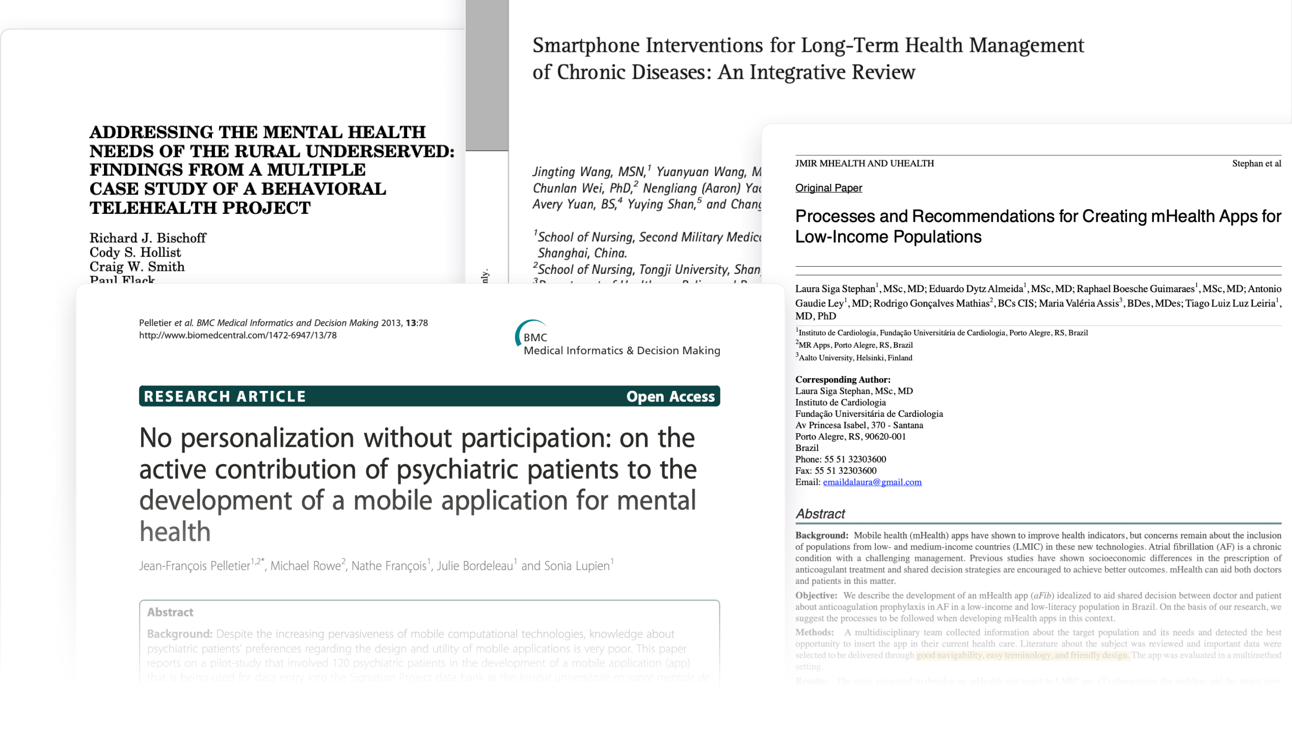
We analyzed over 30 research papers to figure where techonology can intervene during a mental health crisis.
 During a mental health crisis, even simple tasks look daunting. Thus, the solution must provide personalized info & feel approachable.
What's out there?
We reviewed 18+ apps which provided resources for mental health.
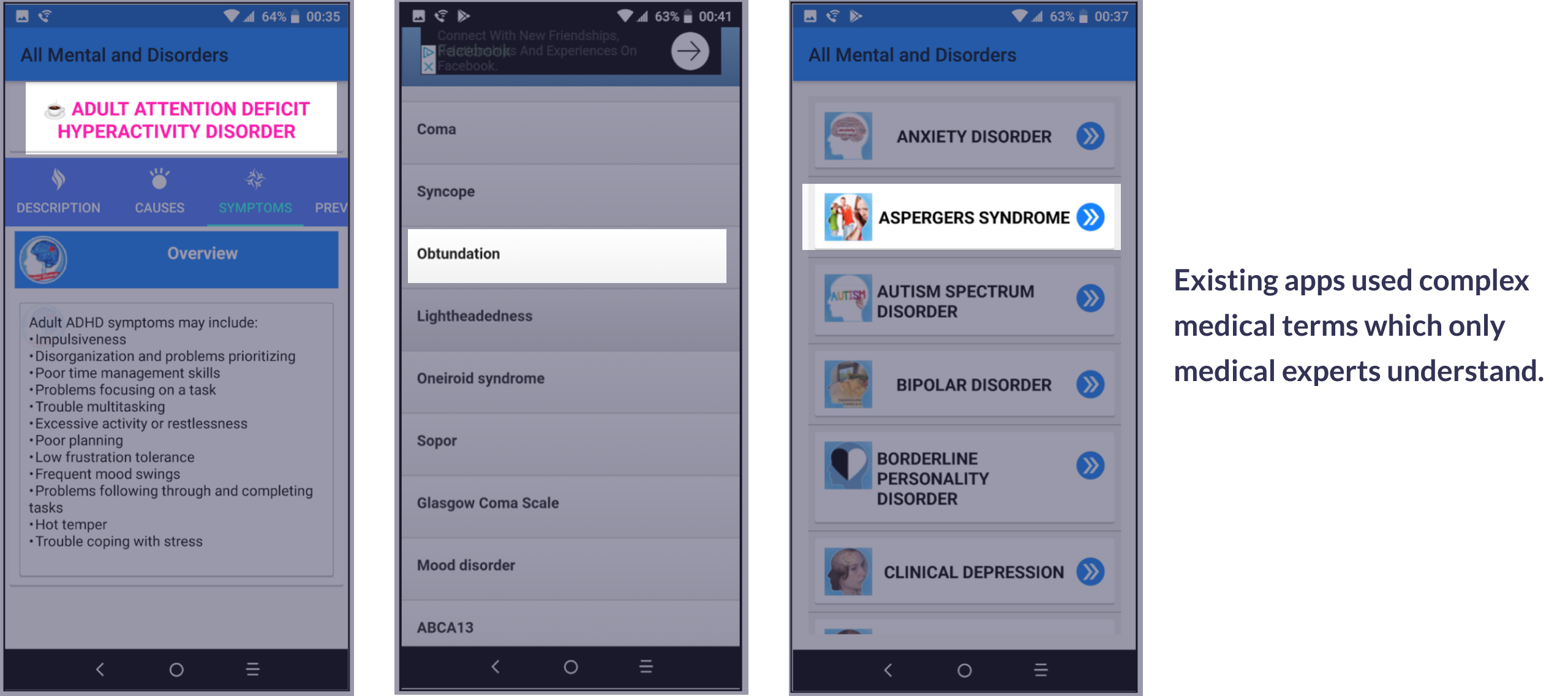
Existing apps lacked use of everyday language which people can easily relate to and associate with.
Resource categorization
NAMI provides several informational pamphlets during their sessions for generating awareness on mental health.
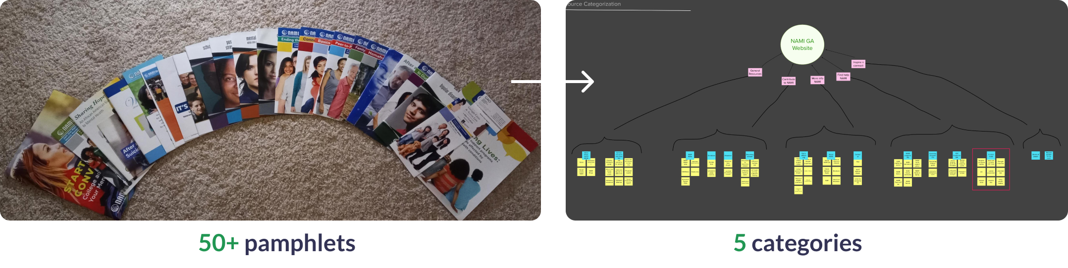
We analyzed and categorized 50+ pamphlets and developed 5 categories to organize the resources.
Phase 2
Synthesizing Insights
Context Map
To organize our findings about context of patients, caregivers and first responders we created a context map.
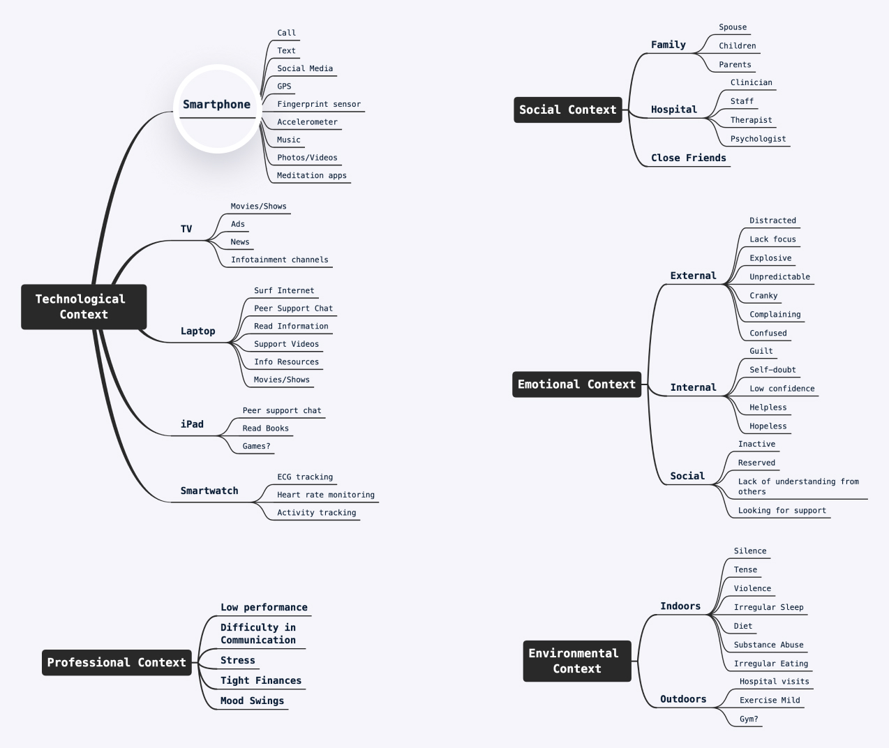
Patient Context Map
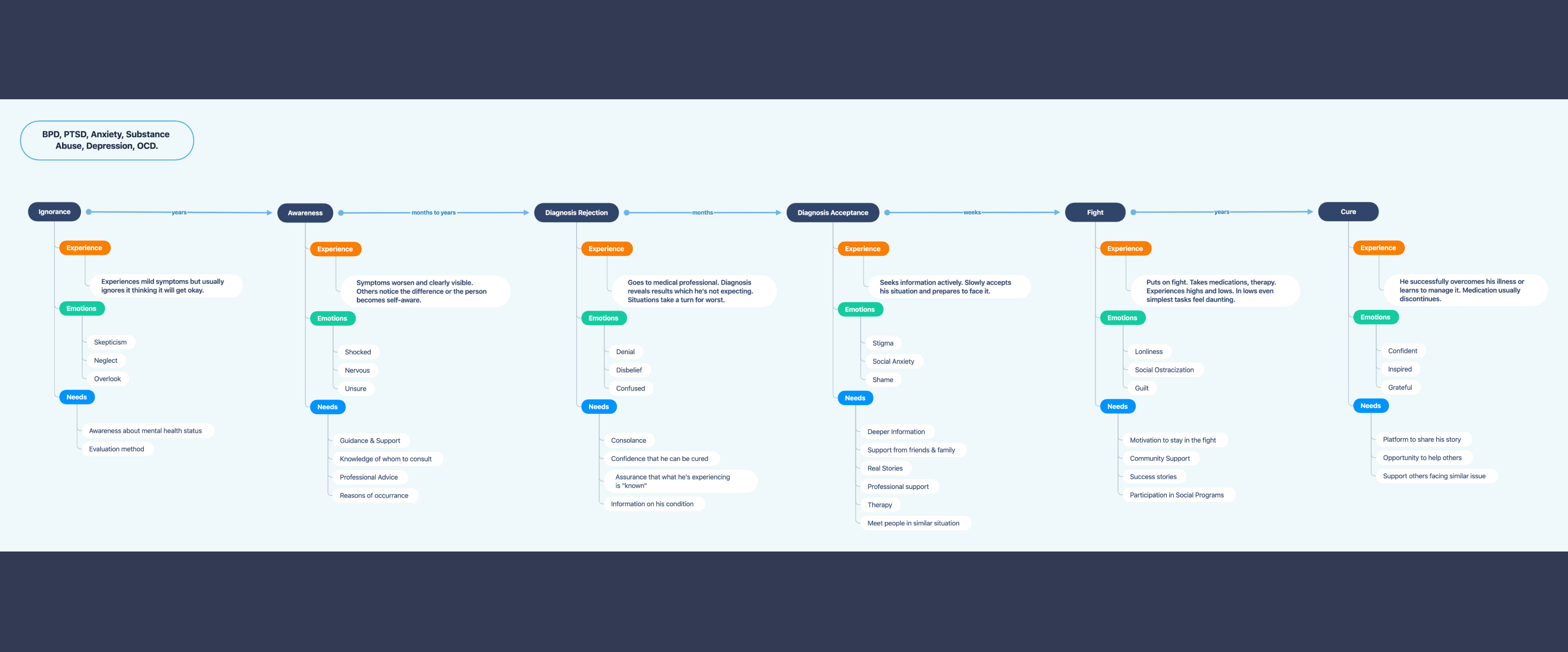
Patient Journey
After examining several blogs, podcasts, articles we created a patient journey. We mapped emotions, experience and needs at every stage.
We decided to design a mobile app as our strategy to achieve our goal for 3 reasons: universal availability, offline access to content, personalize-able.
Phase 3
Prototype Creation
I created the information architecture of the app based on the resource categories and developed a concept prototype to get feedback from the users.
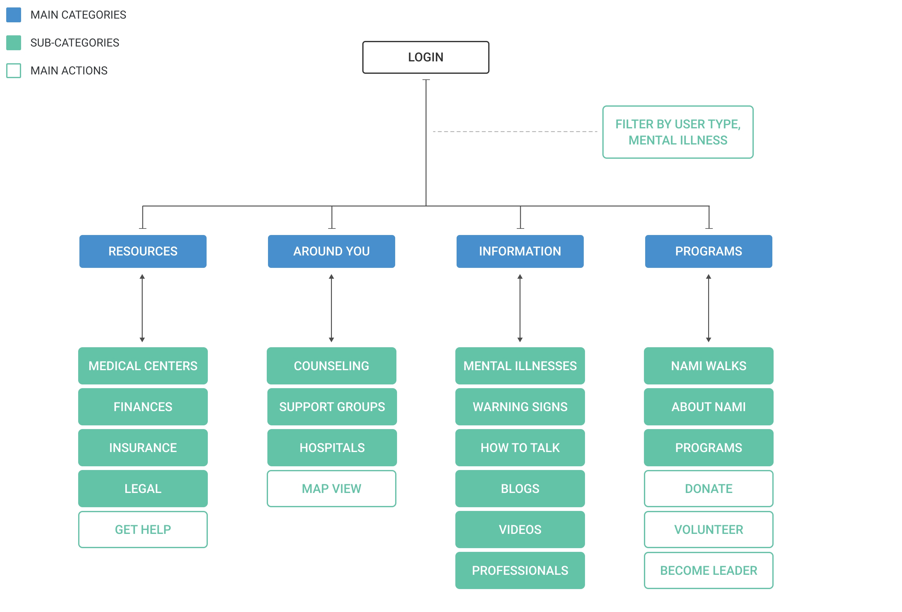
App Information Architecture
Concept Prototype
I used Figma to create a concept prototype.
Phase 4
Design Evalution
Participatory Design Feedback
We conducted participatory design session to evaluate our approach with a police officer, clinical social worker, student caregiver and a mental health activist. We used stickies and dot voting to get their feedback on the concept designs.
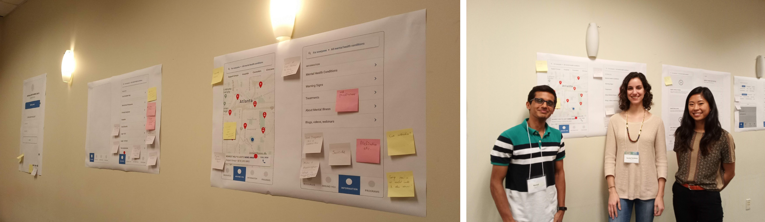
We used stickies and dot voting to get feedback from users on designs.
- Main findings from the focus group:
- Landing page confusing– The app's landing screen provides resources for different users, with an ability to filter. However, showing all the resources upfront causes confusion.
- Everything relevant in one place– We segregated resources in distinct sections with a hope to enhance findability. However, we discovered that users need all relevant resources in one place.
- Not comfortable calling– Young adults are not comfortable directly calling on an unknown number. They don’t know what to expect.
Phase 5
Final Design
Final designs incorporated feedback from the focus groups. It was a complete revamp of the app architecture to make it more understandable. We brought all resources in one place providing ability to favorite and added a chat function which is more comfortable for young adults.
Interactive Prototype
The Design
Personalizing landing experience
In onboarding we identify motivation of the user and surface relevant content right away thus, saving them from hunting for filters or searching information.
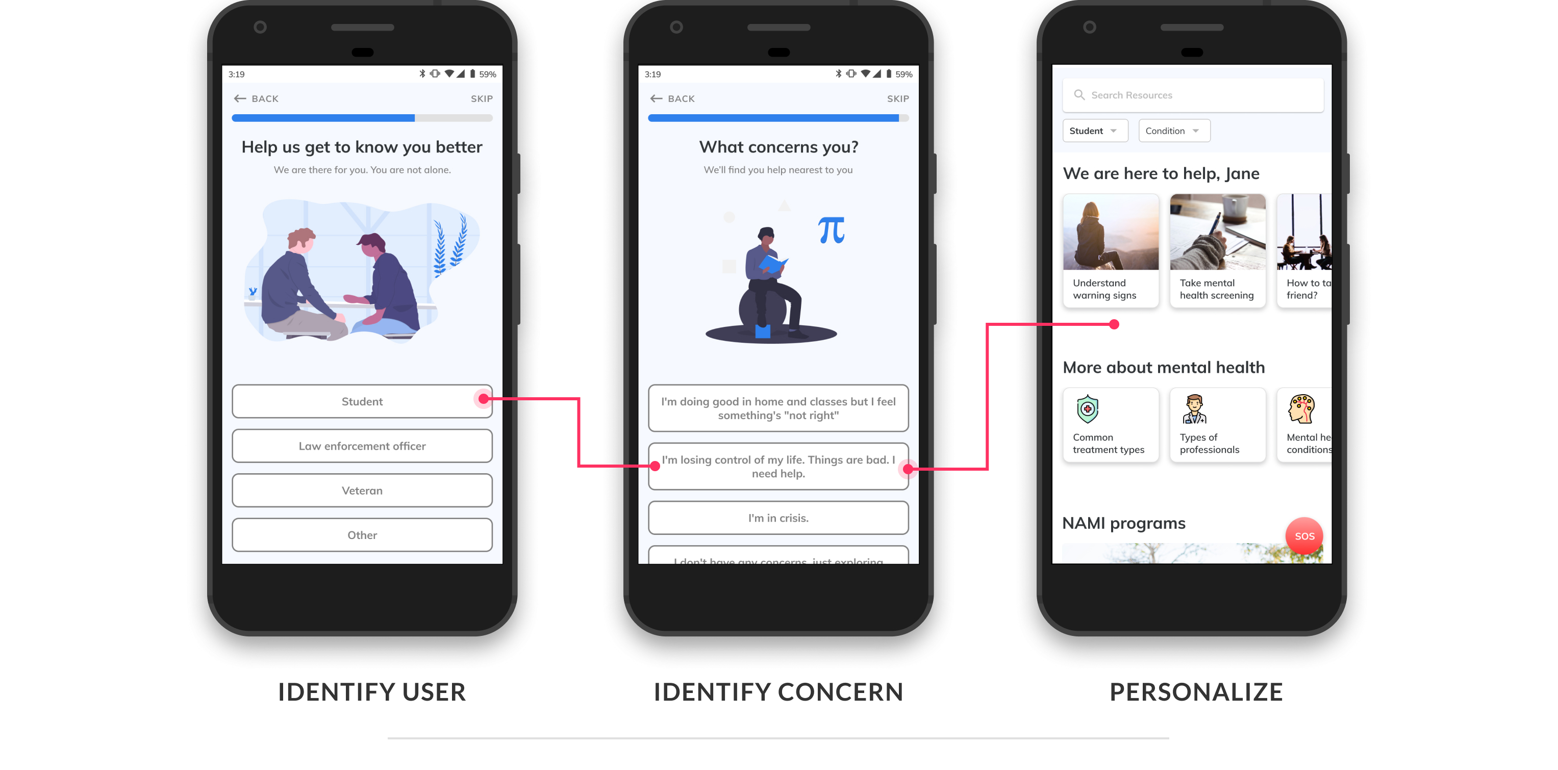
Onboarding helps personalise experience right from start
Using everyday language
We avoid the use of medical jargons and use everyday language which people can easily associate with. This makes the app approachable.

Using everyday language enhances trust
Easy findability
We surface relevant filters at every stage and support a map view. It thus, reduces the effort and time required to find help.
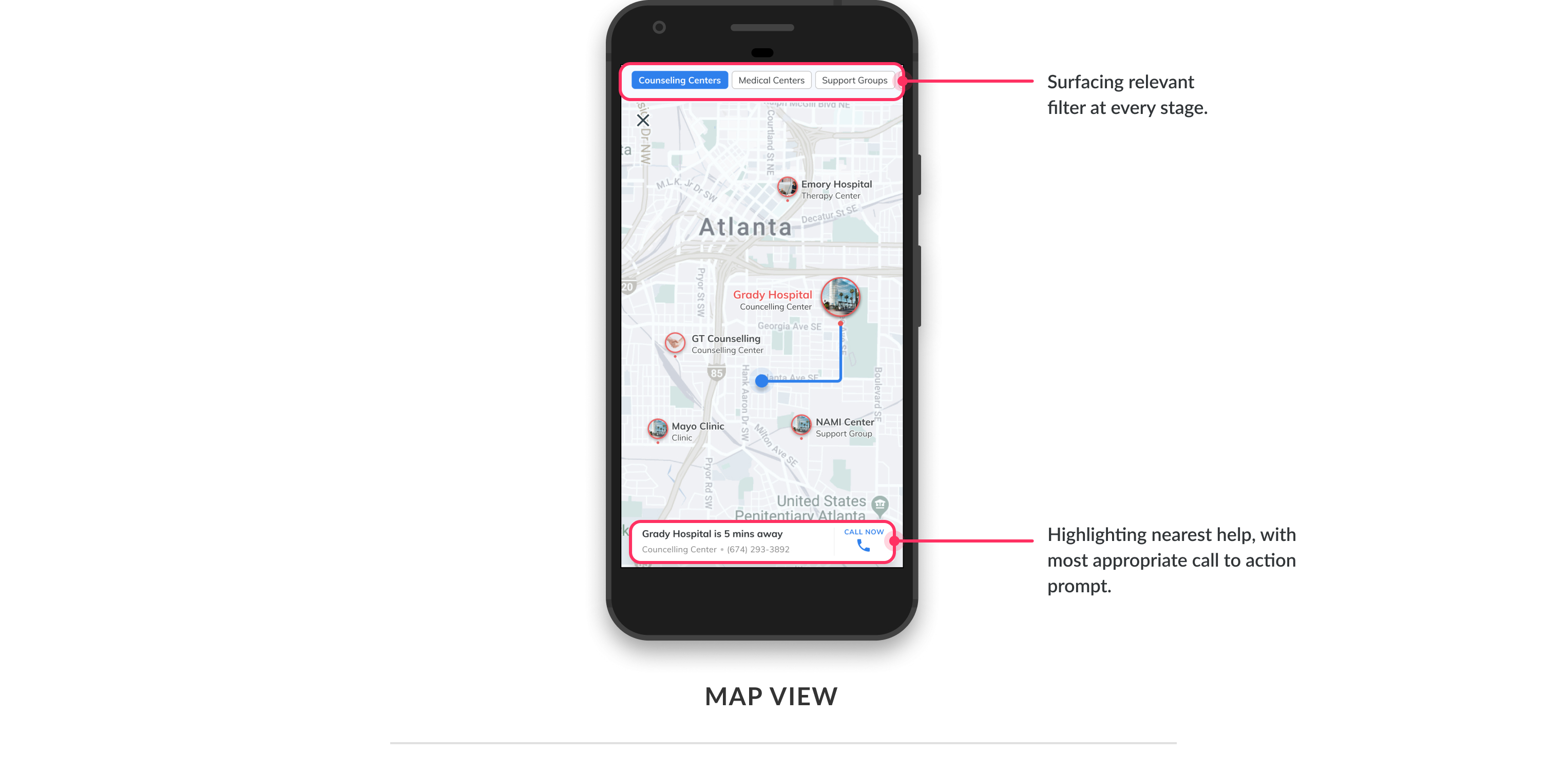
Map highlights nearest resources and shows a prominent action.
Next Steps
As next steps, this app prototype will be developed into a fully fuctional product by development team in NAMI.
I hope our work will have a positive impact of millions of Americans, helping them navigate the mental health crisis effectively.