In 2019, Nutanix (B2B cloud computing firm) made a massive shift from traditional term-based contract pricing to subscription-based pricing. Their customer acquisition strategy changed from cold-calling customers to offering self-serving product trials.
I was tasked with the critical responsiblity of reimagining their product trial experience.
My Role
I led the UX redesign for the product trial experience. I collaborated with a UX Researcher to conduct user interviews and usability tests to validate my designs.
In addition, I collaborated with a senior designer, 2 project managers, engineering team and solutions architect to drive convergence for shipping initial viable designs. I also pioneered use of Figma at the company.
The product was launched globally on September 8th 2020.
The Challenge
Enterprise products are feature rich, complex and optimized for power use. This experience is not ideal for potential customers who want to try out the product before they buy it. Elaborate setup is required before they see the value proposition of the product.
Breaking down problem
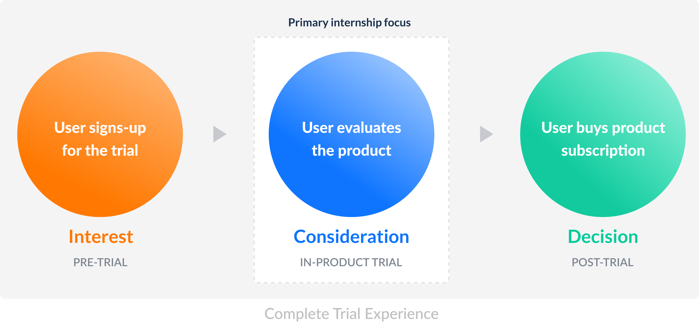
I broke down the trial experience into 3 segments: pre-trial, in-product, post-trial. I met with the product leaders to define scope, understand team’s priorities and set expectations.
Project's high-level goals were to:
1. Help new users understand the product.
2. Show value proposition of the platform quickly.
3. Provide support to help them make a purchase decision.
Breaking down problem statement helped me narrow down the problem scope, and bring clarity to what I should be focussing on during my internship.
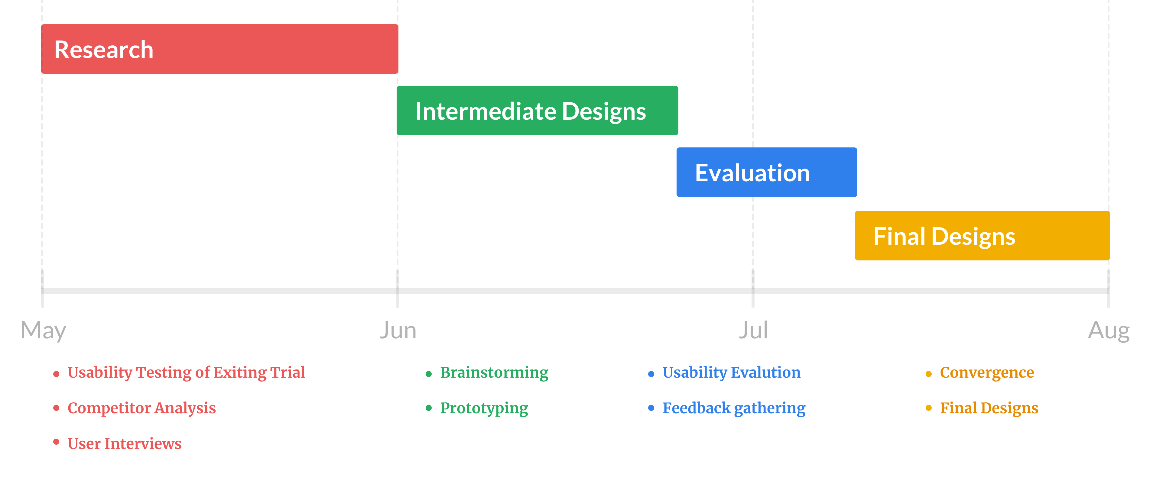
Phase 1
Starting with what exists
Existing trial experience
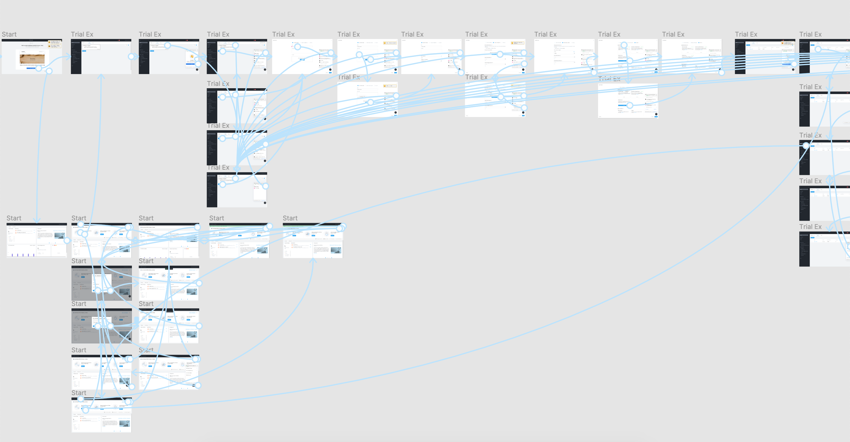
To understand what worked in existing trial, I conducted usability tests with 3 participants. I discovered major usability issues in the current experience.
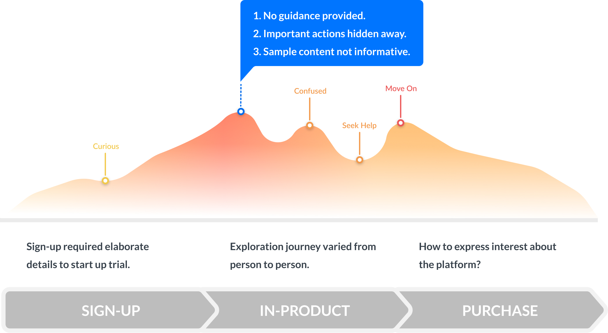
Existing trial user journey
 Users explored product randomly because there was no guidance. And important options like help were buried deep in navigation.
Digging into data
Last year's data revealed some interesting stats about user behavior in a trial.
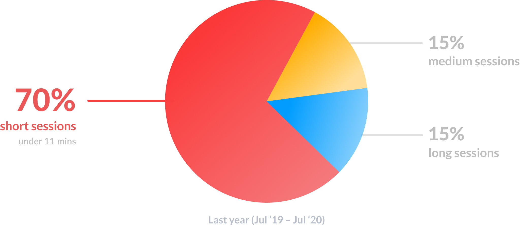
On an average, users spent less than 11 minutes in a trial after they first logged in.
Competitor Analysis
Benchmarked direct and indirect competitors across sign-up, in-product trial and purchase phase against the existing trial experience.
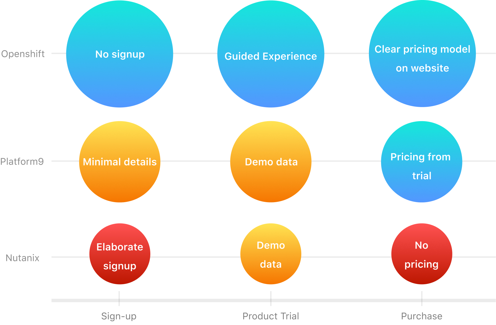
Openshift used short tutorial to onboard users, provided step-by-step instructions. Platform9 provided easily accessible in-product help.
Trial users were finding it hard to navigate the product. They were confused about how to get started. The product help wasn’t easily accessible.
Phase 2
User Research
Interviews
To probe deeper into needs of trial users, I collaborated with a UX researcher and interviewed 7 potential customers across 6 continents.
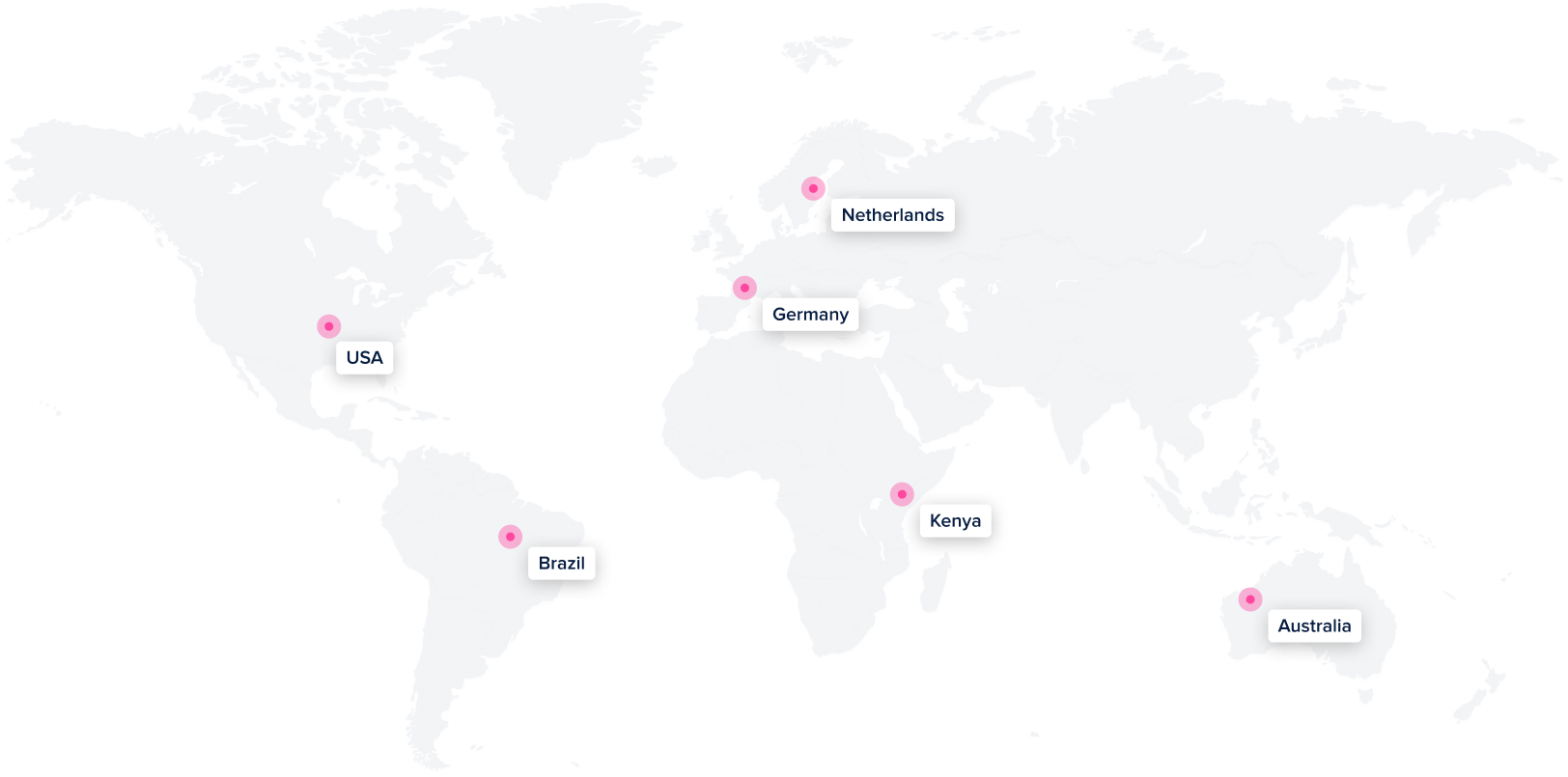
I interviewed customers across 6 continents to understand their needs during a product trial
User Personas
Based on interviews I developed 2 personas to highlight the trends in the data.
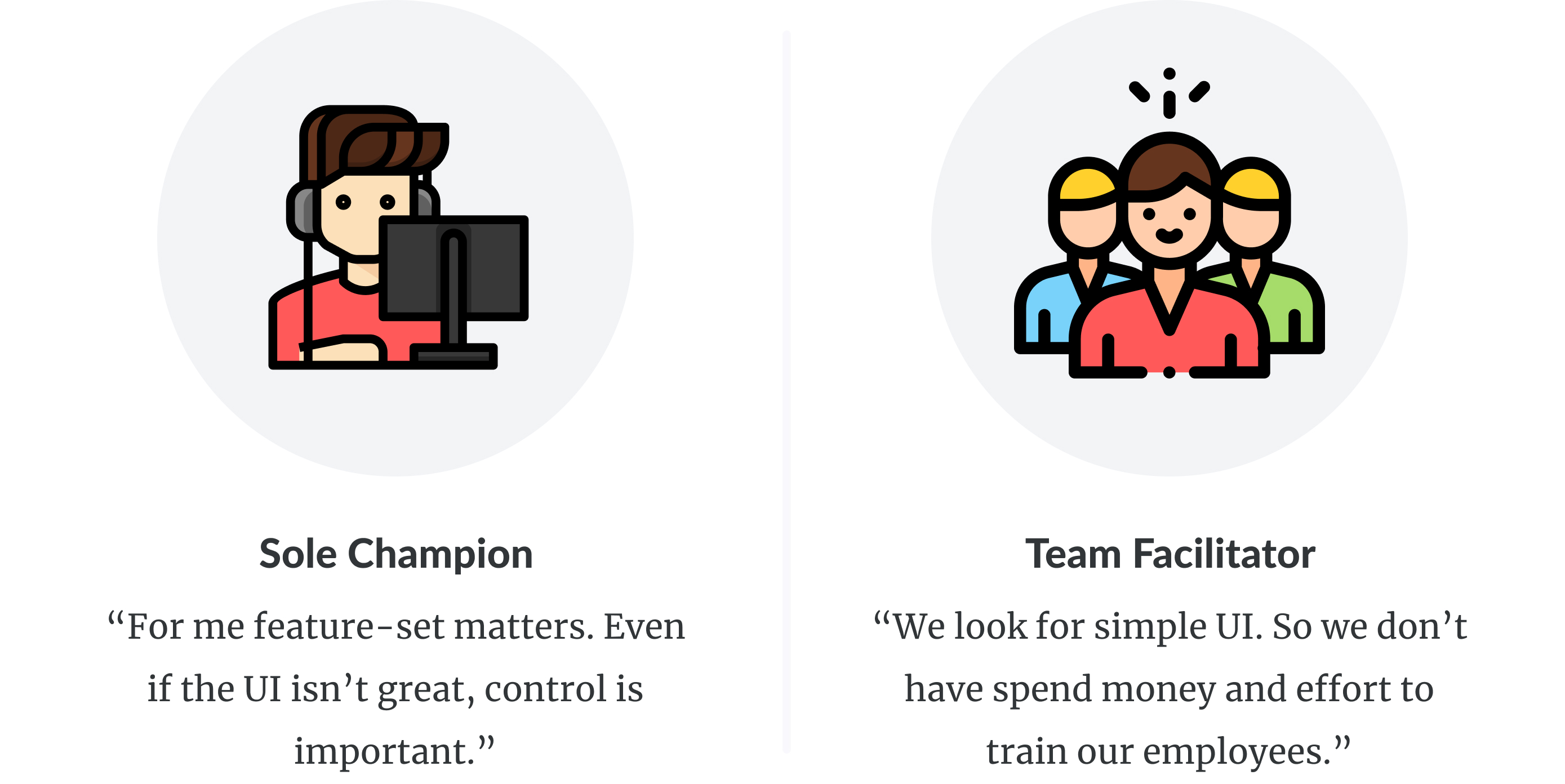
In small orgs, users look for feature-set rather than UI. Their job responsiblities overlap. To learn more, they prefer documentation.
In organization with large teams, users look for simple UI so they don’t spend time training employees who administer the platform.
Conversion Journey
I mapped user-actions and user-context at various stages in customer's buying journey based on the interview data.
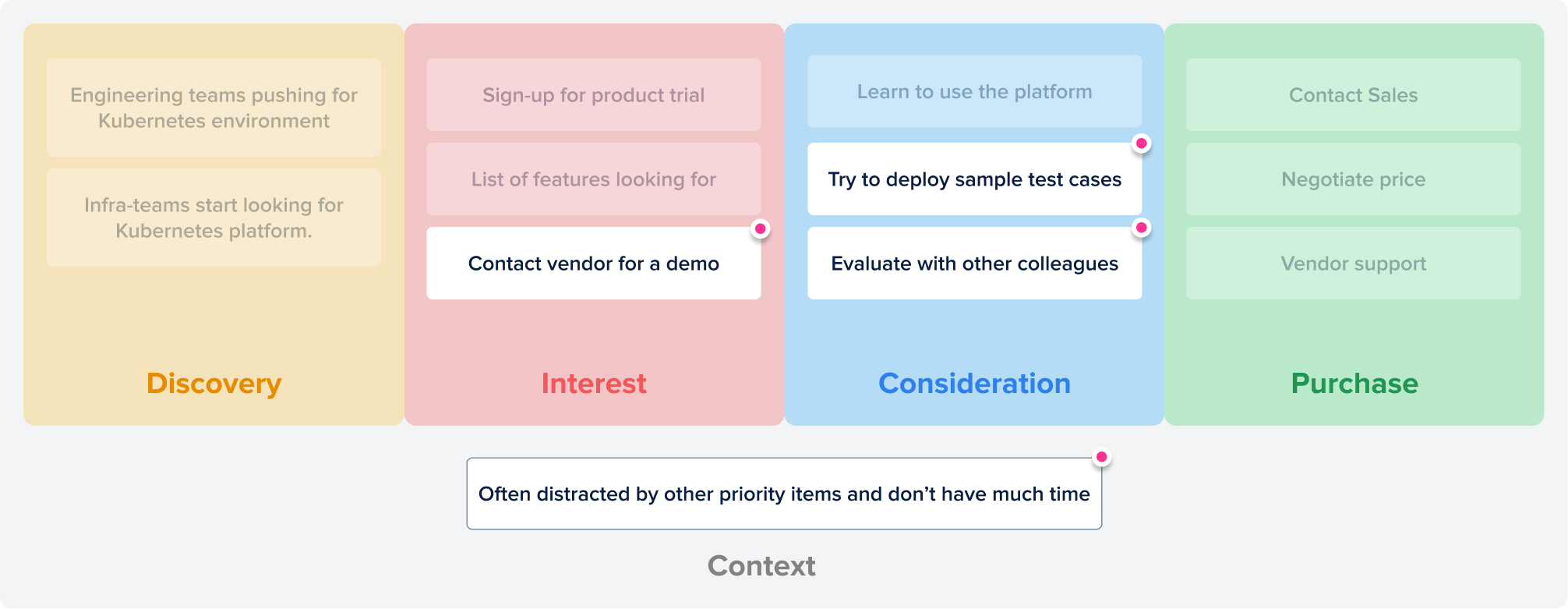
Users collaborate with colleagues to evaluate a product. Require buy-in from multiple teams. Often have other priority items on list.
Users collaborate to evaluate a platform, they are distracted, they don't have much time, how do I optimise trial for these constraints?
Phase 3
Divergence and Evaluation
Onboarding
I started with onboarding experience as one of the pain points was lack of guidance.
The goal for onboarding was twofold:
(1) Emphasize value proposition of the product relevant to the user.
(2) Provide meaningful context quickly, as I found, users don't have much time.
I considered various options:
• Customize onboarding based on company or role information.
• Using a video or onboarding to provide context.
• Providing a tutorial or a catalogue of tutorials to get started.
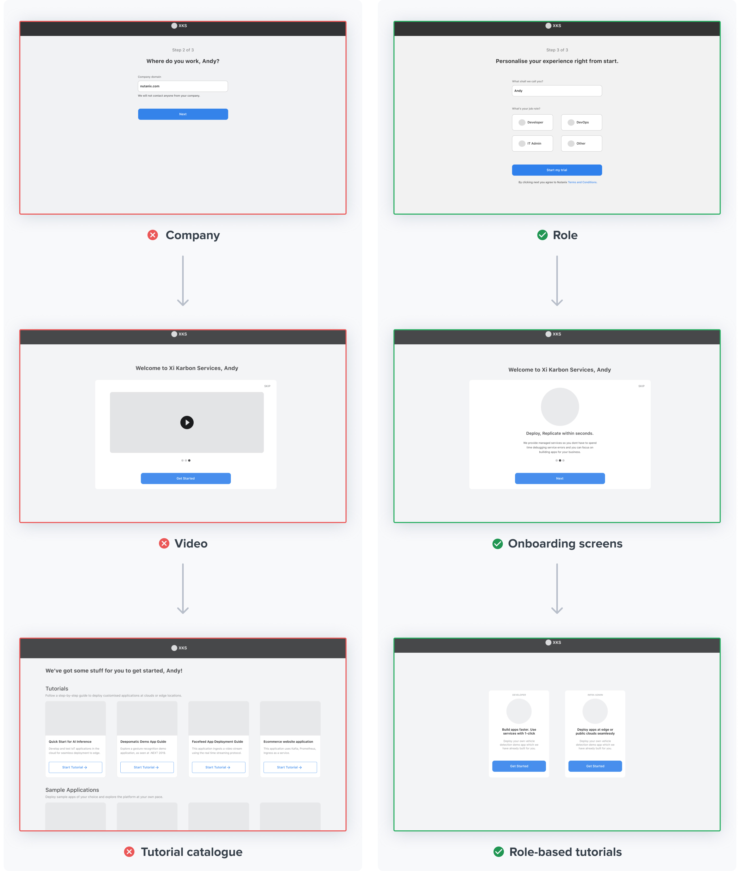
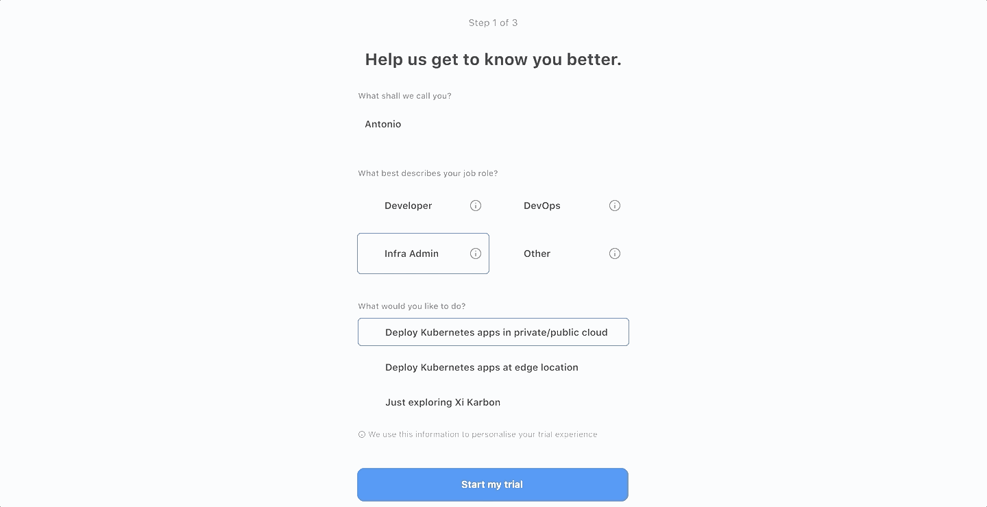
- When users started the trial, I asked their
role info to customize onboarding. But I avoidedcompany information as it wasn’t necessary for customization. - Videos are a good way to educate customers on website, but I preferred customized
onboarding screens to communicate value proposition within product, asvideo would delay them in getting started. - Tutorials are great way of providing initial guidance to new users (reasons covered in next section). I decided to highlight a
couple of relevant tutorials to get started instead of atutorial catalogue, which would overwhelm new users .
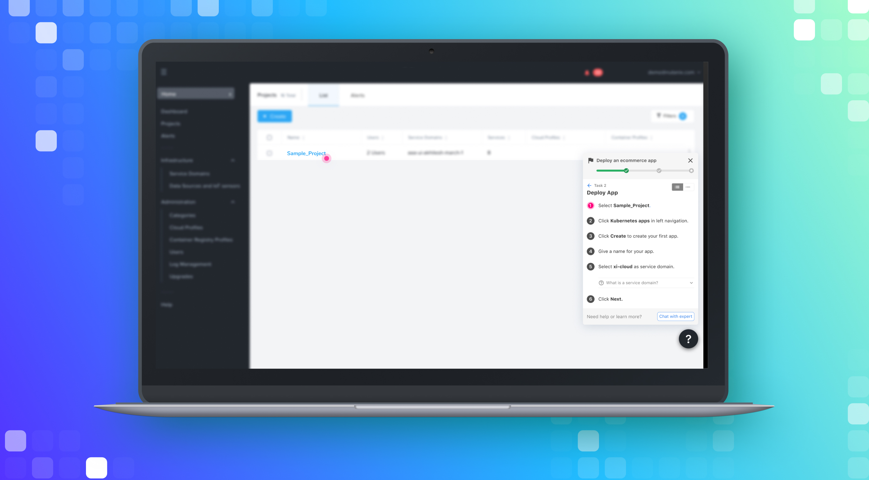
In-product guidance
Next I looked at in-product guidance, as I had discovered during usability tests that users were finding it hard to navigate the product.
The goal for in-product guidance was to help users navigate the product without hampering their exploration workflow.
I considered various options:
• Having short tutorials.
• Showing progress card on dashboard with main actions like LinkedIn.
• Using a popup to introduce a new section.
• Just opening up a new tab with documentation.
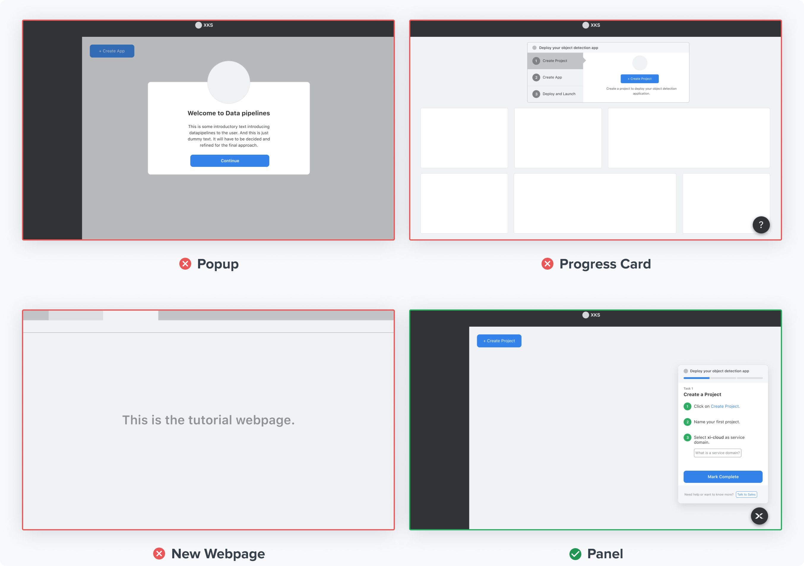
I decided to use self-paced tutorials as a way to help trial users navigate a product because I discoveredsales team used short tutorials in workshops to educate new customers about a productwhich were very effective.
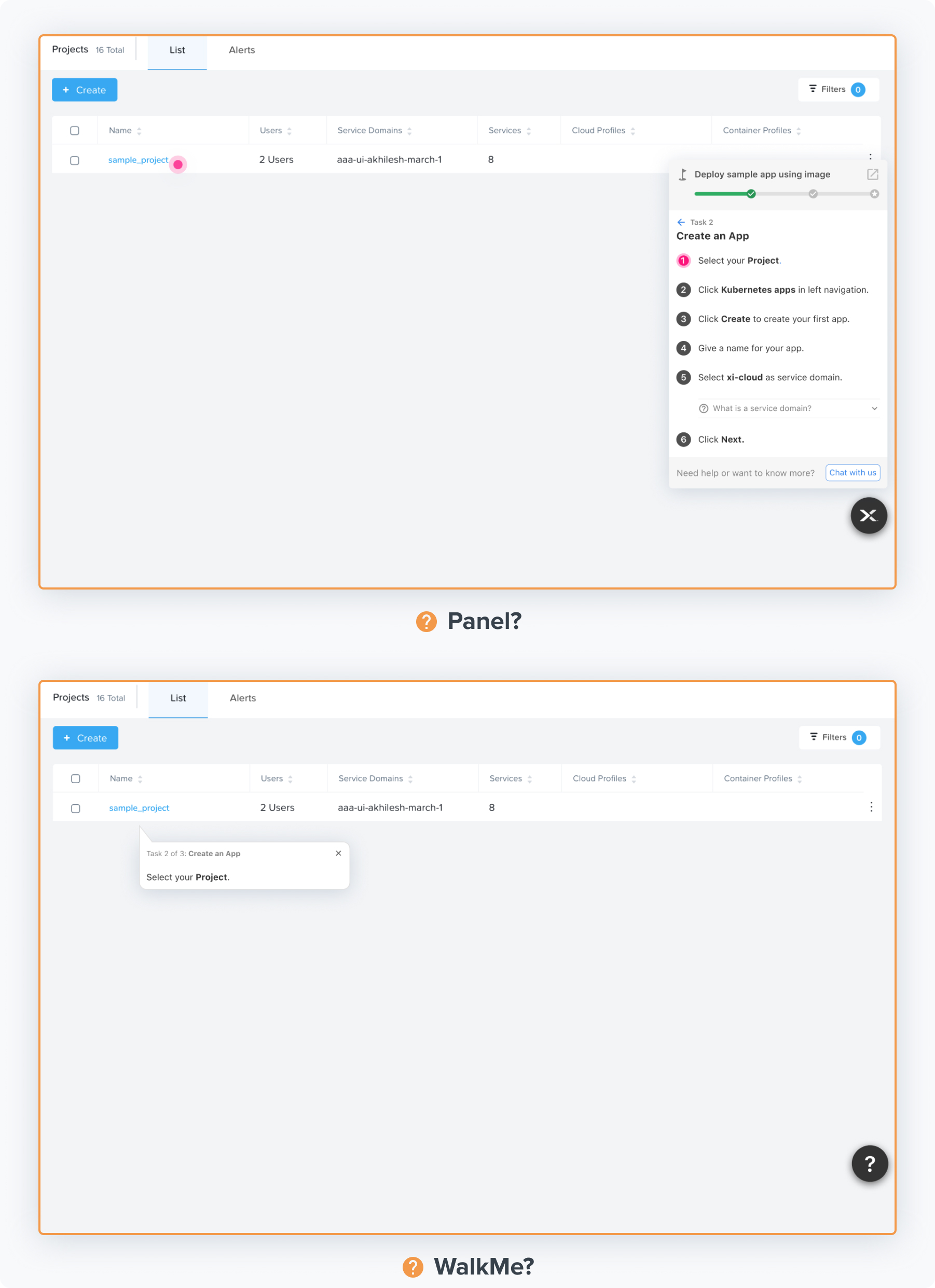
- I zeroed-in on two options,
a floating panel with tutorial instructions and aWalkMe bubble that walks them through instructions one-by-one. I figured thatboth options accomplished required goals. And so, I was stuck.
Evaluation
To resolve the conflict, I prototyped a sample tutorial in both the approaches and conducted a within-subjects study with 7 users.
Prototyped sample tutorial in both approaches with hi-fi interactions for user evaluation in Figma
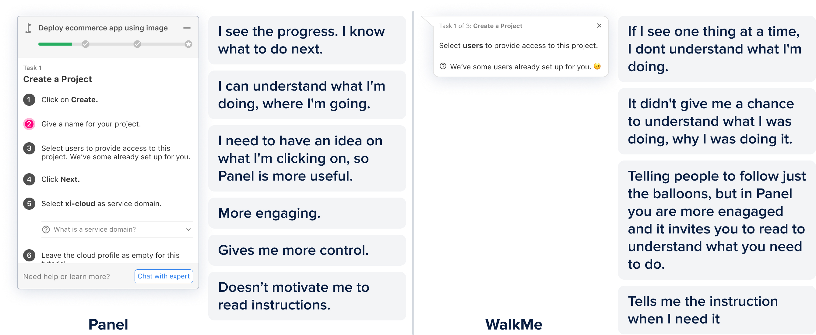
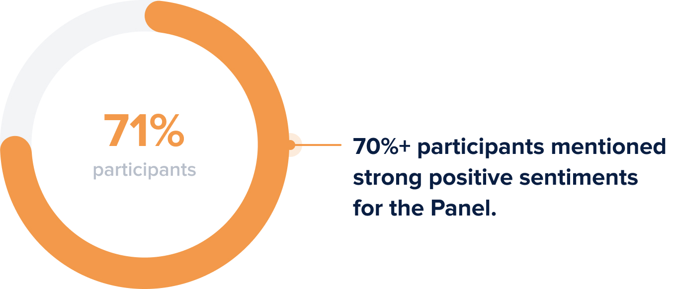
Participants found Panel approach more helpful because of it's flexiblity and ability to provide over-arching context...
Phase 4
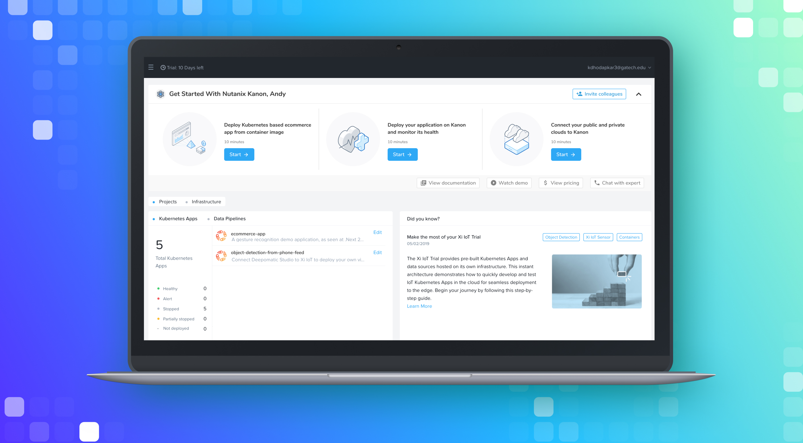
Final Designs
Personalize and Onboard
Know the trial user, understand their goals and
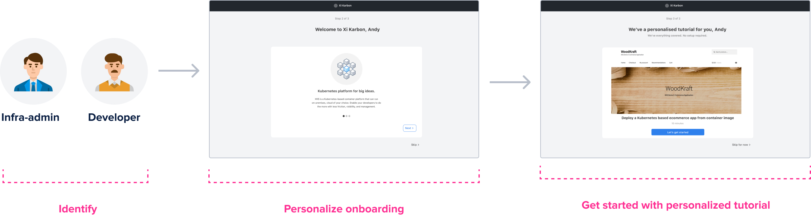
Based on user's job profile we personalise the onboarding screens and tutorial
Guide and Delight
We guide the user through a short tutorial with pre-deployed setup and
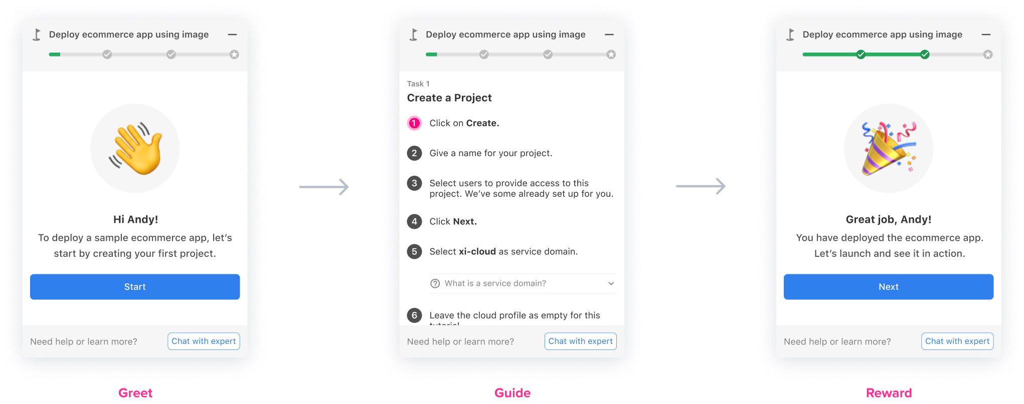
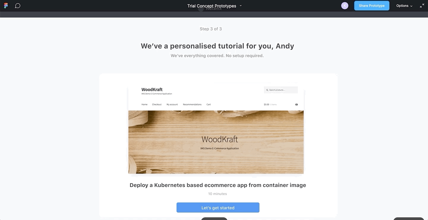
We greet people with name, delight them rewards thereby increasing chances of engagement
Facilitate and Empower
We provide trial users required actions in dashboard so they are easy to find.
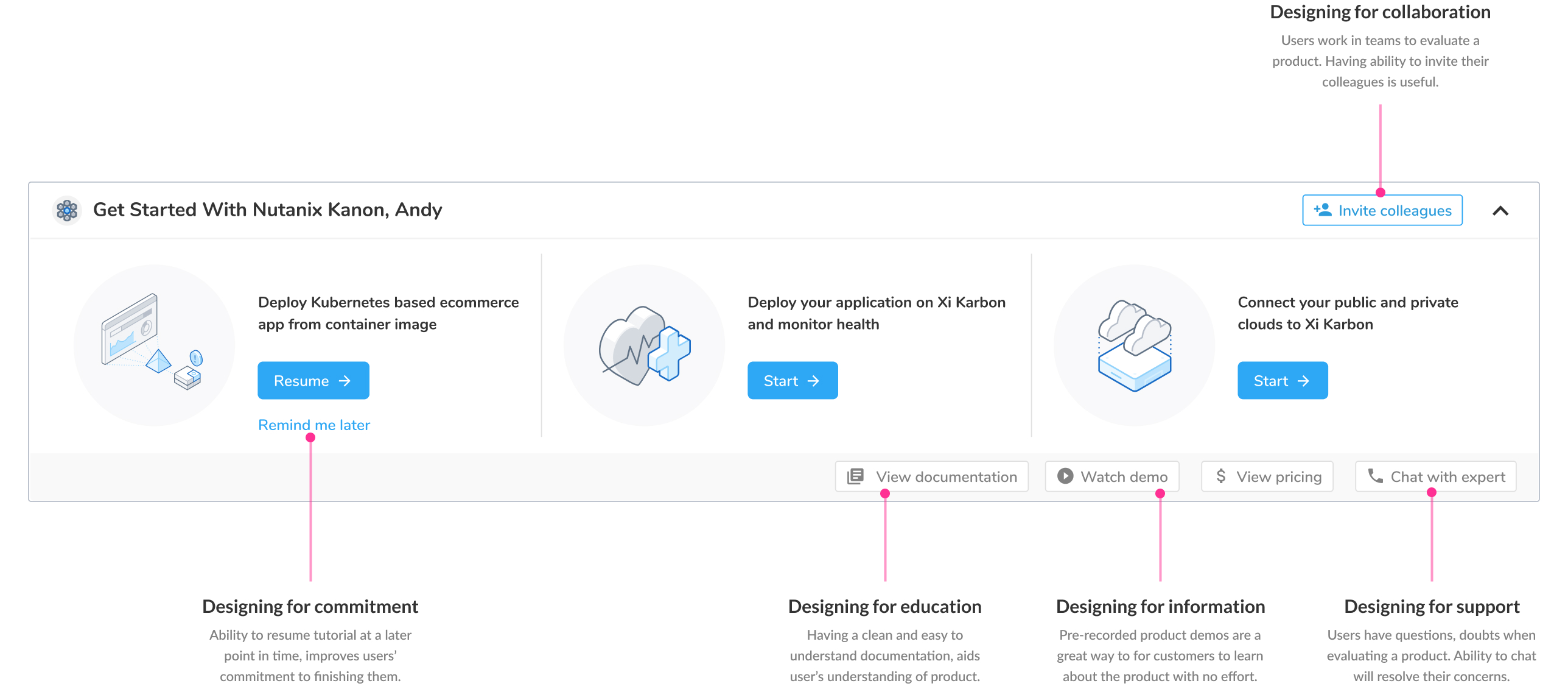
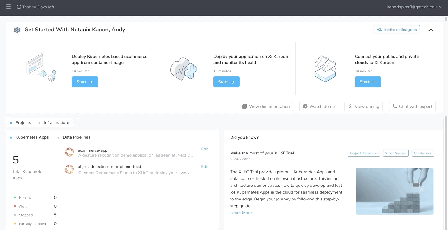
Users can invite their collegues with one-click. This greatly supports them in decision making
Accomodating Distractions
As users work in distracted environments, ability to
Users can set a reminder for finishing up the tutorial based on their schedule
Designer's Dilemma– Ideal vs Practical
Mid-point during the internship, business strategy pivoted from it’s decided path. I was dejected initially to find that my designs were no longer achievable in the available time and resource constraints.
I was faced with a tough choice:
Should I keep working on the ideal user experience or should I ditch my work and start over?
To resolve the dilemma, I
This showed my vision to the leadership team at the same time helped the them meet critical launch deadlines.✨
Reflection
- It starts out fuzzy, but keep at it and focus on the process: I was flustered initially because of complex problem space. However, as I understood business and user goals, clarity emerged. Staying laser-focussed on the user helped me add crucial value to the project.
- Get into field, validate assumptions: I started out with many unknowns. User interviews were necessary to bring clarity but could've stretched the project timeline. Nevertheless, I decided to conduct them. In retrospect, they helped me understand complete user journey and make informed decisions.
- Involve stakeholders in the process: The business needs kept evolving over the course of my internship. Regularly sharing my work with the leadership helped me think more strategically. I was able to better support my team at the same time not compromise on the product's experience.
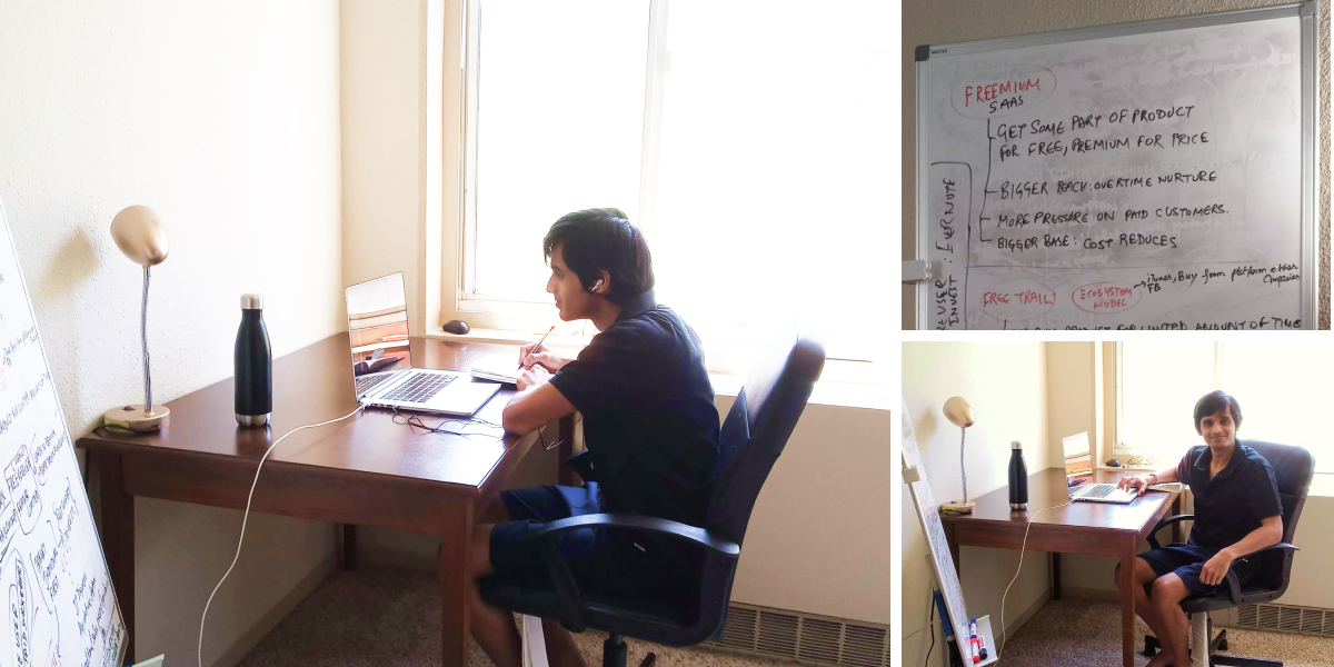
Listen to my complete internship experience on HC-Hive podcast, where I share my strategies for a successful remote internship with Georgia Tech students.