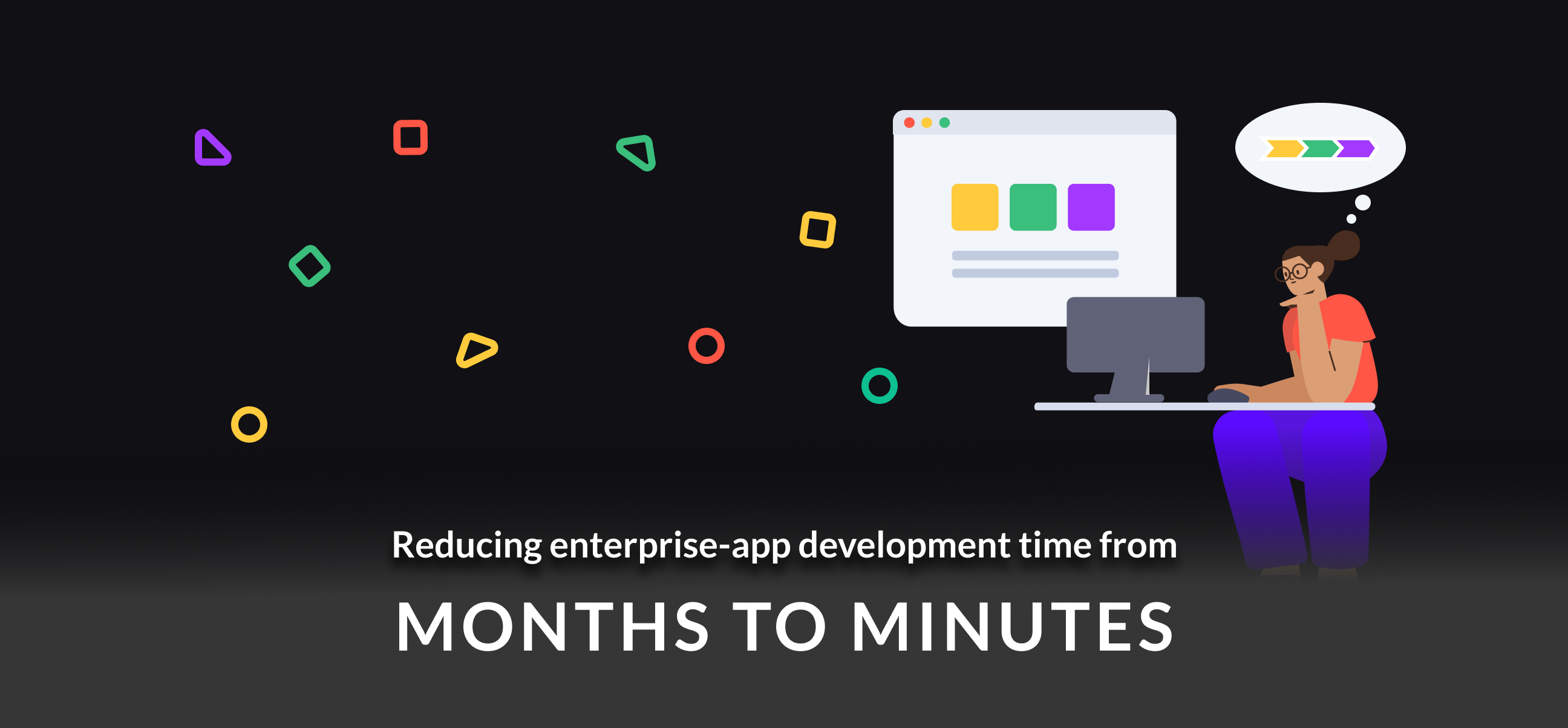
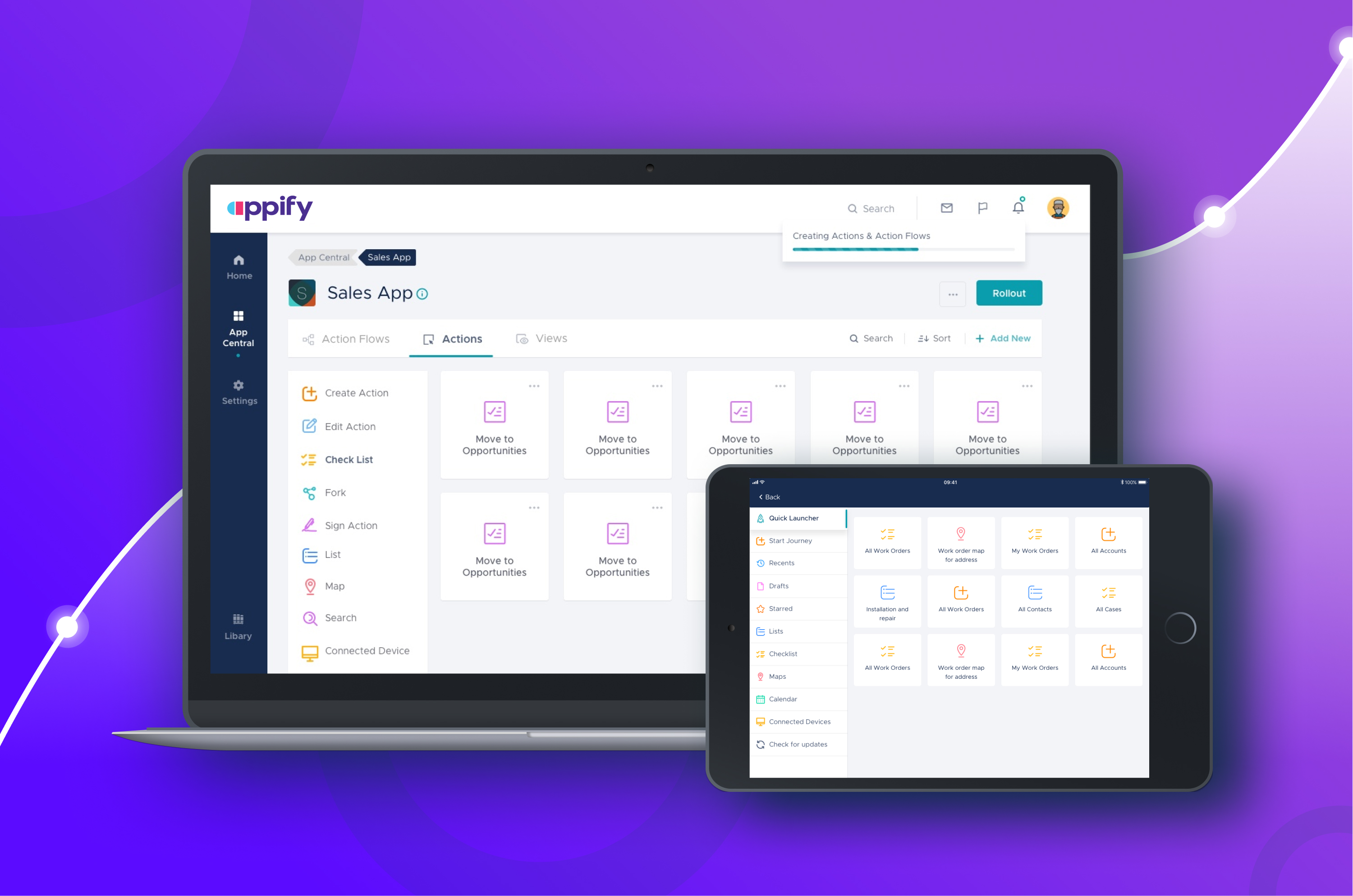
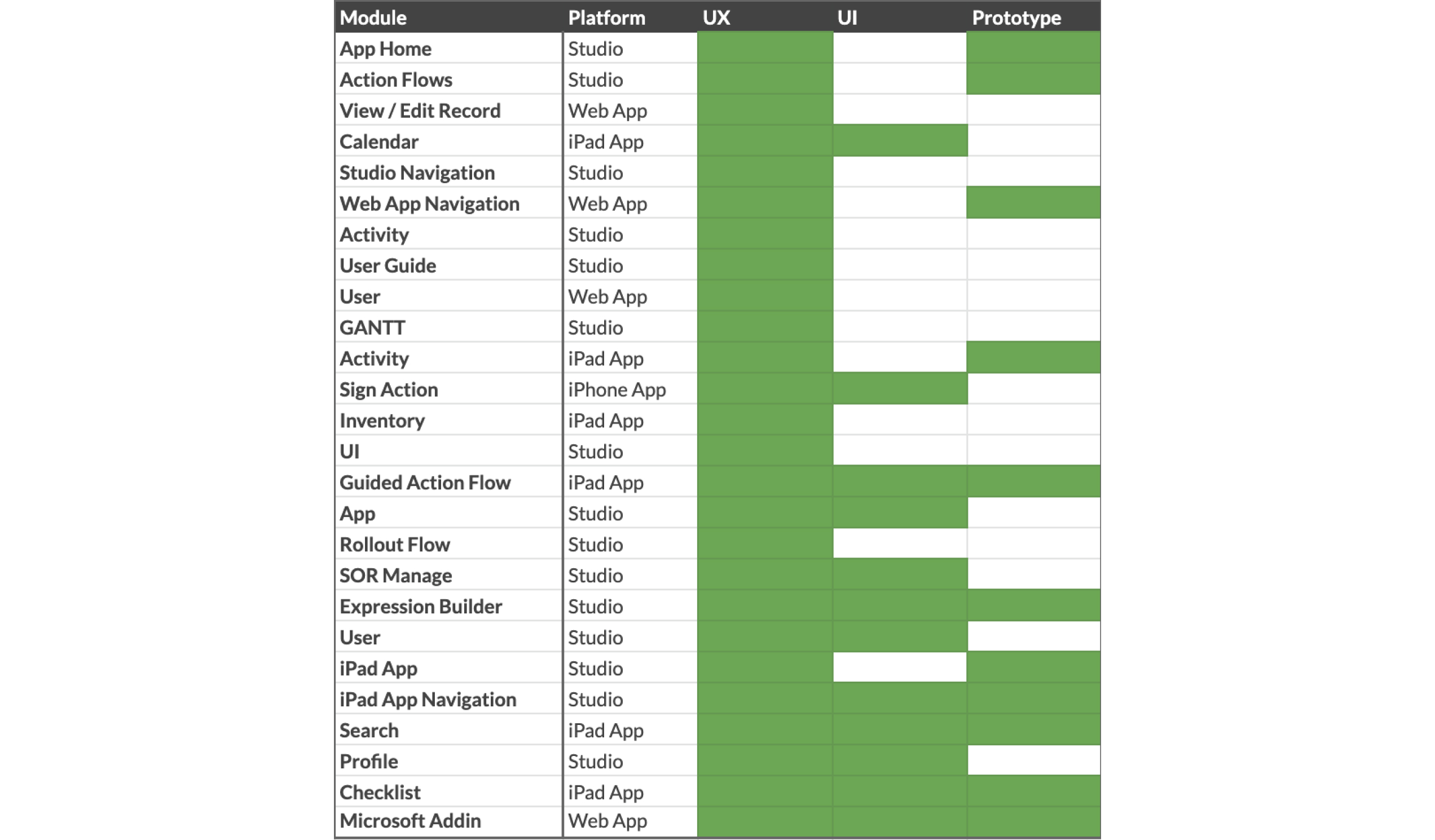
App Studio
The Expression Builder
App admins need to configure business logic into workflows. This is core to any enterprise app. However, these expressions can sometimes be quite complicated.
How do we enable IT admins to create complex business logic in a simple, efficient and intuitive way, without having them to code?
Goals for the Expression Builder
I started by drafting high-level goals for this module. This was critical to ensure my designs accomplished their purpose and remained useful to the users.
1. Efficient: Create complex conditions quickly, with ease, and with least effort.
2. Intuitive: Interactions should be evident, have minimum learning curve.
3. Clean: Layout should make the expression visually easy to grasp.
Competitor Analysis
I looked at diverse portfolio of products with similar features to understand interface patterns.
I decided to go with the triad structure because of simplicity and intuitiveness.
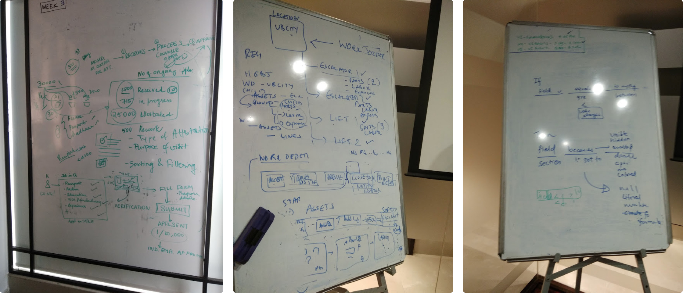
Brainstormed ideas based on competitor research and business requirements
Early Prototype
Based on the research and requirements, I create a low-fi prototype to get early feedback from internal users, and senior designers in the studio.
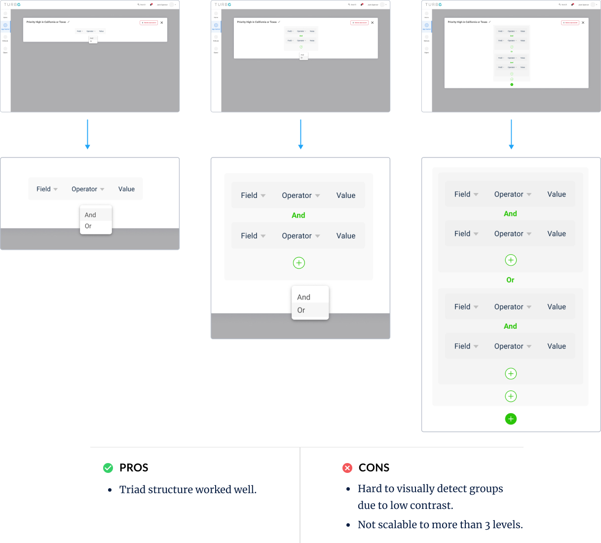 I found, the triad structure worked well, but box inside box didn't have sufficient contrast and couldn't be scaled to multiple nested levels.
Iterate and Refine
I iterated multiple times to discover limitations, new users requirements. With every iteration, I increased fidelity of my designs.
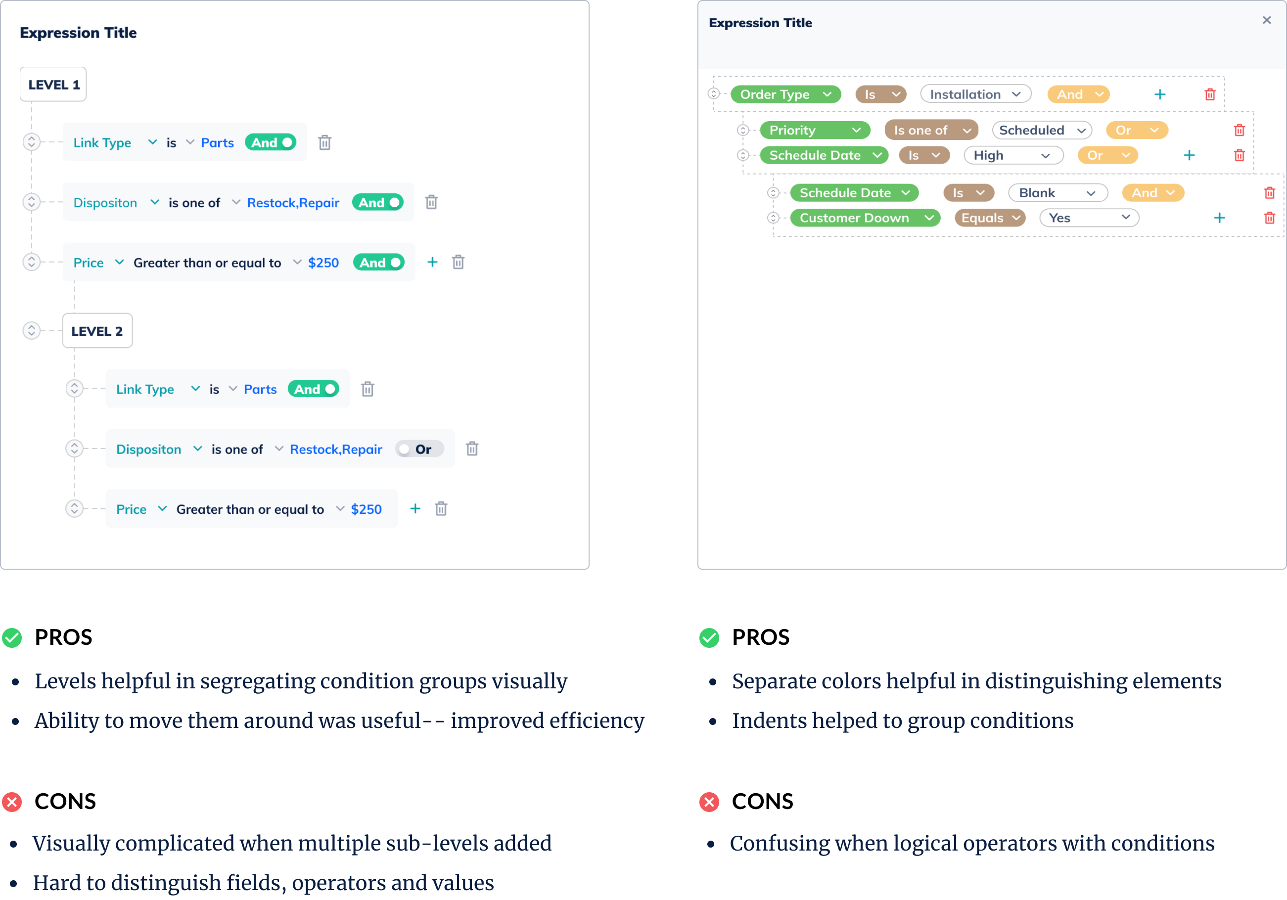 I discovered that distinct colors for field, operator & value improved readability and indents were helpful in differentiating nested conditions.
Deeper than Interface
I noticed that competitor products used all operators for each field. Users had to figure out relevant operators themselves. This increased selection times and chances of error.
Having a comprehensive list of operators and their relevant operands, increased efficiency, reduced chances of error and improved overall experience.
Behavior Driven Approach
Worked with dev team to implement Behavioral Driven approach for the logical structure, so logic is easily traslated into everyday language for admins.
Usability Testing
I conducted usability testing with a clickthrough prototype with the internal users to discover usability issues in the designs.
Issues discovered
- Cluttered view: With nested conditions the view became cluttered easily.
- Re-create conditions: Cumbersome to create same conditions multiple times.
- Rigid structure: Stucture did not allow them to make customizations easily.
Final Designs
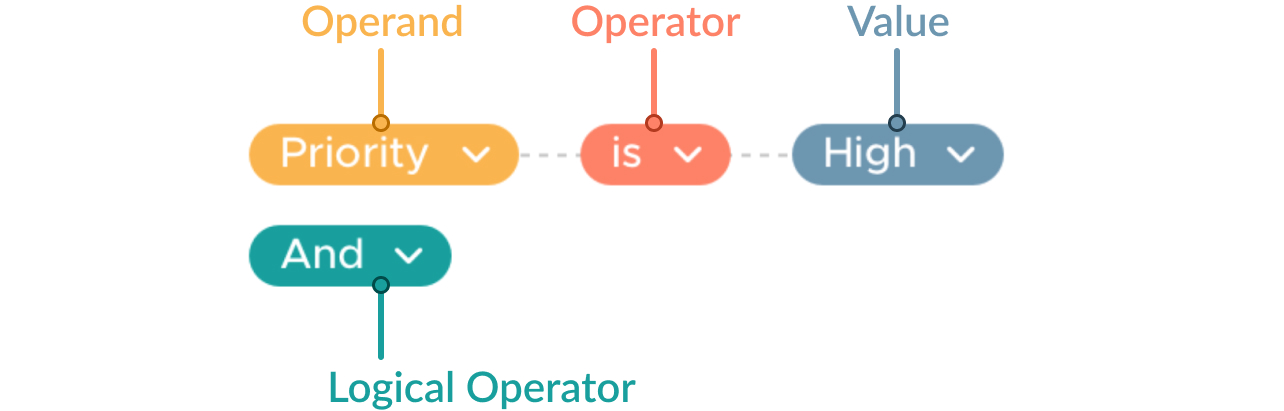
Triad Structure for Simplicity
Field, operator, value structure is used across many products, is simple to understand, intuitive and requires no learning curve.

Color Coding for Visual Clarity
Distinct colors for field, operator and value help to add visual segregation between elements and improve readability.
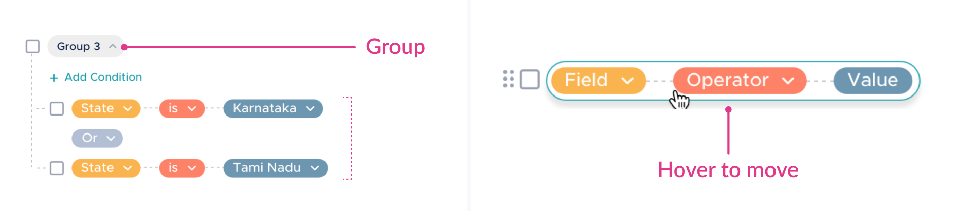
Grouping and Hover for Efficiency
Having a ability to visually abstract the conditions under group will reduce visual clutter and hover to move will help to create complex expressions with ease.
Ensuring Accessibility
Testing out my colors for various visual impairments helped me ensure that my design is accessible to everyone.

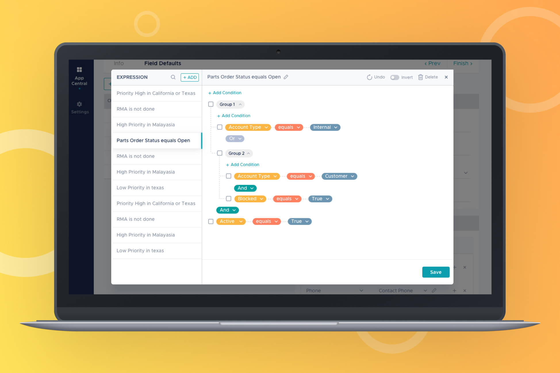
The final design of the expression builder
Final Evaluation
I conducted usability testing with a prototype with 3 internal users by giving benchmark tasks. Main findings from the evaluation:
- Intuitive Interactions: Users were able to figure out functions of various elements within the interface.
- Visually Clear: Users understood the expression, the structure and the interactions.
- Enhancing Efficiency: They expressed suggestion to duplicate expressions for making the workflow more efficient.
For App Users
The Roadster
Appify's Roadster is the mobile app created by the admin using The App Studio.
On-field Employees
In short, we were not designing for ‘the’ user. Their profiles and tasks vary greatly. We followed universal design principles as we were designing for the world...
Structure for infinite permutations
In Studio, admin can practically create infinite combinations of components. Thus, we created a universal stucture which could handle those permutations.
Navigational components
These were critical part of the app. They accomodated scalable and fixed sections depending on the admin’s configuration.
I chose bottom navigation for fixed sections and vertical side panel for custom sections to keep it scalable.
Prototype, Prototype, Prototype
Having a seamless navigation strcture was core to this app. Thus, I ended up creating multiple prototypes for navigation.
Accessibility button for universal functions
One of the navigational approaches involved novel interation in the side panel.
Getting Expert Feedback
As I created a novel interaction for the side panel, I decided to get feedback from the senior UX designers in our design studio.
Based on their feedback, I decided to use standard interactions as the new approach required significant learning curve for low tech-savvy people.
Final design of the iOS app
The Impact
Product Launch 🎊
Appify was launched globally in January 2019, and as of today is serving a global customer base spanning 6 metropolitan states across US, Denmark, New Zealand and Canada.
When Appify started, stakeholders were reluctant to have any kind of UX process. However I'm happy to report, today Appify hosts an in-house design team. This is one of the unseen impact of our commitment towards designing a great user experience, and the one I'm most proud of.
What I learned
- Empathize with users, but also with stakeholders: Initially as a designer, I only empathized with the users. However, I learnt that it is equally important to empathize with the stakeholders as well, because in a company there are many practical contraints of resources, finance to implement a design. This helped me create designs which balance user as well as stakeholder needs.
- Take as much early feedback as possible: During my initial days, I shied away from feedback due to fear of being judged. But I realised how critical it is to take early feedback, not just from users but also from fellow designers, developers, product owners. Everyone analyses design from a different prespective which exposes me to completely new way of seeing my designs.
- Learn from diverse teams: I was often the centerpiece of collaboration. I realized the importance of expanding my knowledge in adjacent domains. While working with the diverse teams, I learnt about marketing, product management, sales etc which made me a far effective designer.
Recommended next for you
Reimagining Product Trial Experience