Students today increasingly prefer digital textbooks instead of a physical one. But when we think of digital books, a static PDF does but a little to make use of the capabablities digital platforms have to offer.
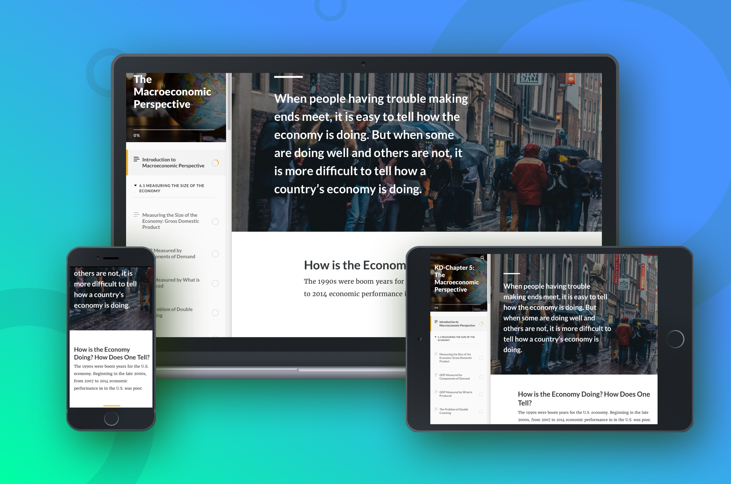
This project was an innovative attempt to transform a 1000 page PDF textbook into an interactive experience for students.
My Role
This project was a collaboration effort between Center of Teaching and Learning and Department of Economics.
I led the UX / UI design of the textbook for a duration of 5 months and collaborated with content writer, course instructor and product owner to create hi-fi responsive designs.
The goal of this project was to design an interactive textbook for students which will make their learning experience fun and engaging.
The Launch
Impact on Student Community
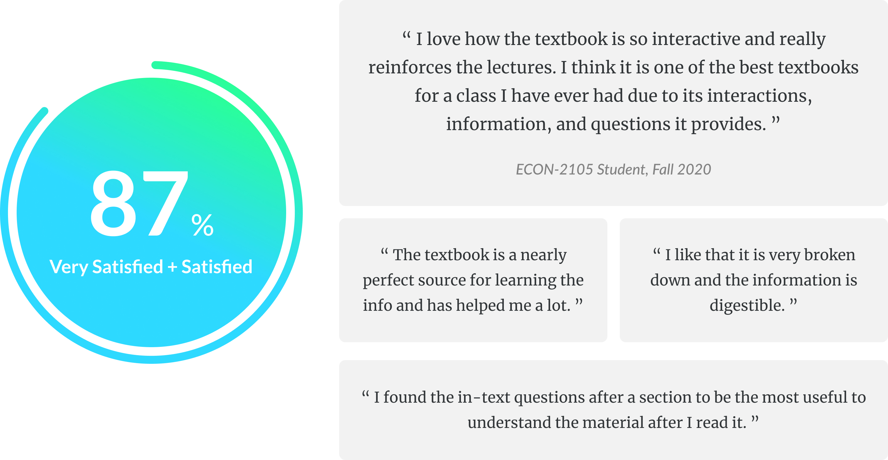
The interactive textbook is deployed to hundreds of economics students starting Fall 2020. It solves their major pain-points with static PDF textboooks and provides them with fun & engaging learning experience.
Process
I started the project with analysing the survey responses and extracting pain-points of students. Furthermore, I conducted in-person interviews with the students taking the course to guide my prototype. Later, I took feedback from course instructor and students to iterate and deploy the final version.

Discovering Problem Space
At the end of each semester Georgia Tech conducts a survey for every course to learn about students’ learning experience. One such survey received a whopping– 300+ responses and revealed a pervasive problem space.
The survey revealed, students found it hard and unengaging to use the long PDF textbooks provided for the course...
Here's what I created
The Interactive Textbook
Navigate seamlessly between topics, search for a topic, topic-wise summary, engaging videos, charts, knowledge checks and more.
Interactive textbook walkthrough
How I got there
Excavating pain points
Survey
To begin this project, I dived into analyzing the survey responses. The survey asked a range of questions about the course. This survey received 300+ responses.
![]()
Students preferred PDF textbook
80% of the students preferred to read digital PDF textbook over physical one.![]()
But found PDF hard to navigate
Students found it very hard to jump between or to find a specific topic. Also, PDFs didn't work well on smaller form-factors.![]()
Book too verbose
Many students expressed their discontent with amount of words. They found text tiring to read.Interviews
I also conducted a 2 semi-structured interviews with the students to dive deeper into their problems.
![]()
Summary useful for quizzes
Students found the summary for every topic very useful and used it in revising for weekly quizzes.![]()
No way of checking understanding
Students couldn’t check their understanding of concepts after they finished a topic.![]()
No reward system
Students who spent hours reading the book. But felt that their efforts were not worth as there was no reward system.Rapid Prototyping
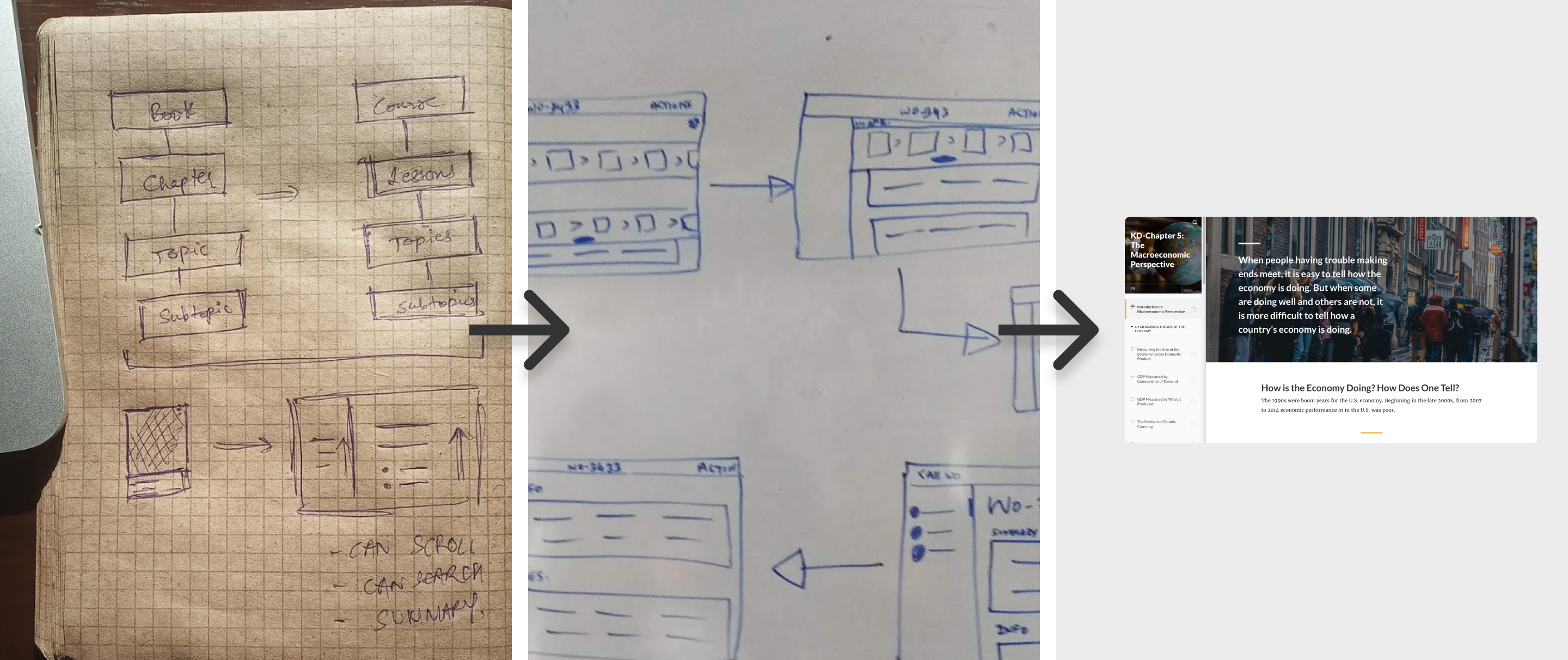
Based on the insights from the surveys and interviews, I worked on creating the prototype for the first chapter of the textbook.
My prototype design was guided from the valuable insights from the research:
- Multimedia elements to bolster engagement: Students found the pdf textbook to be unengaging. And so, I designed multimedia elements within textbook to make it more engaging.
- Self-assesments to check content reflection: I embedded frequent self-assessment exercises in the textbook to engage students by enabling them to practice and reflect on their learning.
- Responsive design to support different form factors: Students learnt course materials on devices ranging from desktops, mobiles to tablets. A resposive design provided them an immersive experience to consume course content.
Prototype Evaluation
Feedback from instructor
I shared the prototype with the course instructor to get her feedback. I was able to refine my prototype based on her feedback.
- Inclusion of videos in summary: Videos help to better understand the topic, thus we decided to include videos in the summary section.
- Creating knowledge check for every topic: I suggested inclusion of knowledge check questions for every topic. This will help students to check their understanding of the concepts.
Evaluation with students
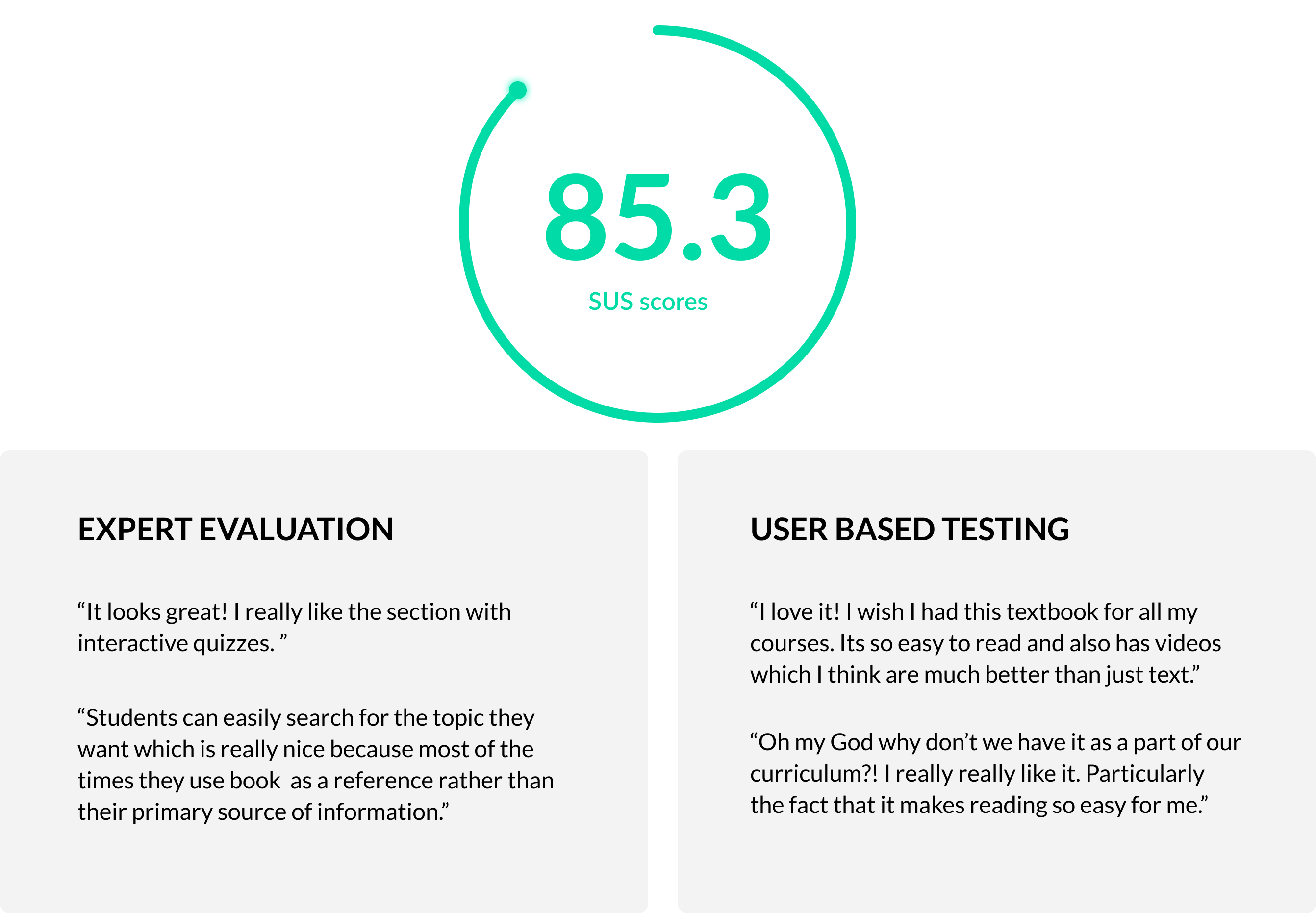
The new interactive textbook received a high SUS score of 85.3. Based on the prototype, I worked on creating the content and UI structure for the remaining chapters in the textbook.
The Refined Design
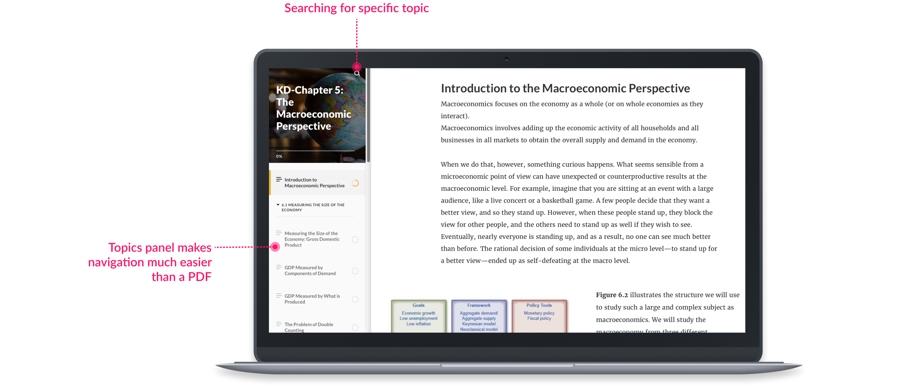
Seamless navigation between topics
Students can search and navigate seamlessly between topics which is a daunting task in a static PDF version of the textbook.
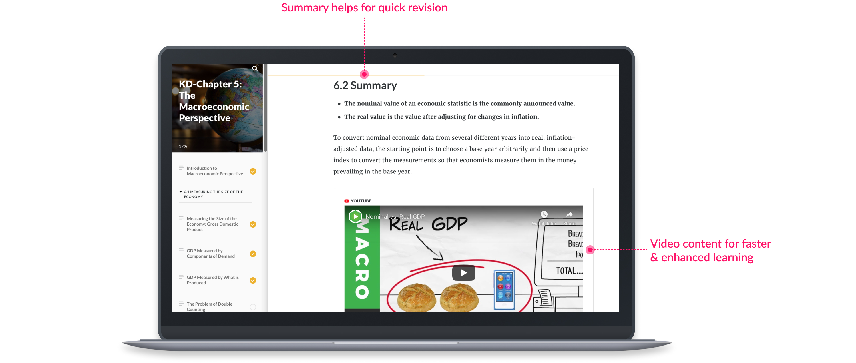
Summary with video content
Students want a quick way to revise topics before quizzes. What better way to get a brief summary of every topic along with a video which explains it nicely!
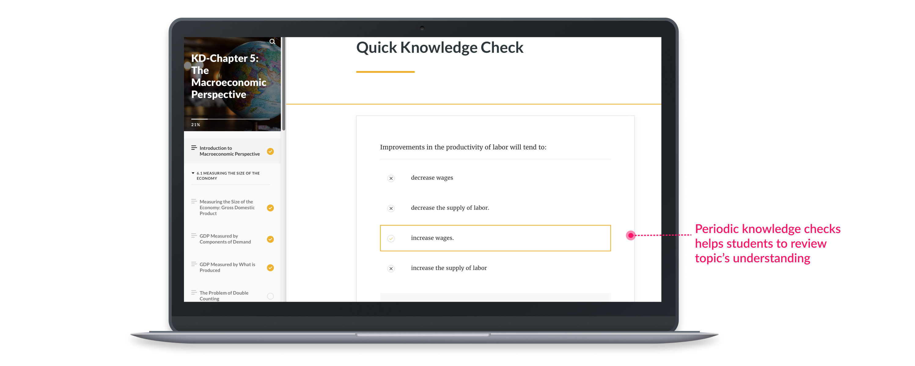
Quick knowledge checks
Students often want to check their understanding of the concepts. How about quick knowldge checks which help you assess which topics you understand and which ones you have to work on.
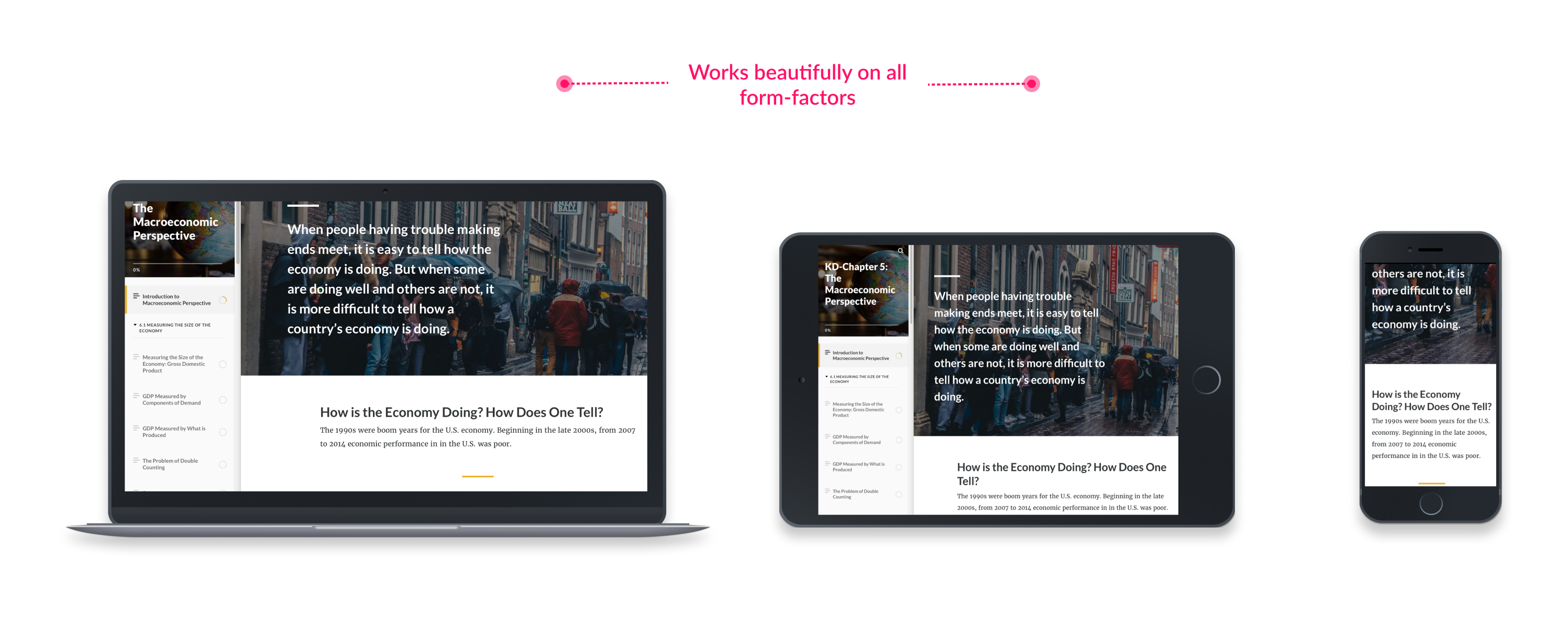
Responsive design
The book content adjusts beautifully in all form-factors. Thus, students can have great reading experience on whichever device they use the most.
What I learned
- Students are learning in completely new ways: During the course of entire project, I was stuck by the fact that how learning is evolving for millenials. With the emergence of new technologies like laptops, tablets and smartphones they have the possibility of a much more engaging and enhanced learning experience.
- Moving towards learning centered environments: With the emergence of new technologies such as AR/VR, I envision that students will soon have learning-centered virtual environments where they can experience how it is to be inside a cell rather than just reading about it. This will completely transform education domain.
- Online communities for learning: With the energence of social media, online communities are the new way of how students will have collective learning experience. A need to enhance online interactions can boost this shift towards online learning.