In fall of 2019, Zoo-Atlanta was struggling to communicate it's conservation mission to millennials. With 50% of Atlanta's population between 18-44 years, millenials have tremendous potential to contribute.
Our goal was to convey Zoo's conservation efforts to millenials in a meaningful way and bring-in the much needed support.
My Role
I worked on this project as a UX Designer for a duration of 4 months along with 3 team members. This project was a collaboration engagement between Georgia Tech and Zoo-Atlanta and emphasized strong research.
Throughout the project, I was also involved in various research activities in conjunction with insight synthesis, ideation, design and evaluation.
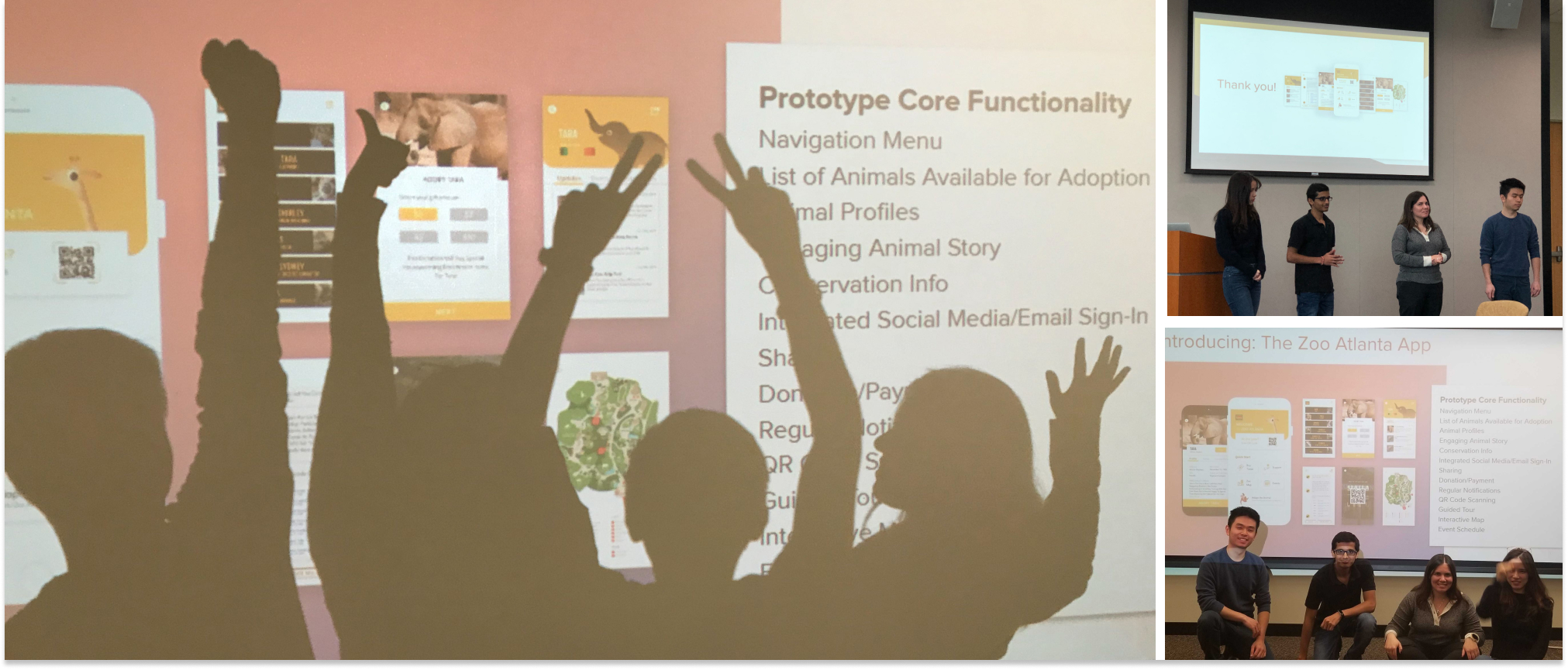
The project concluded with final presentation to the client stakeholders.
Project Timeline
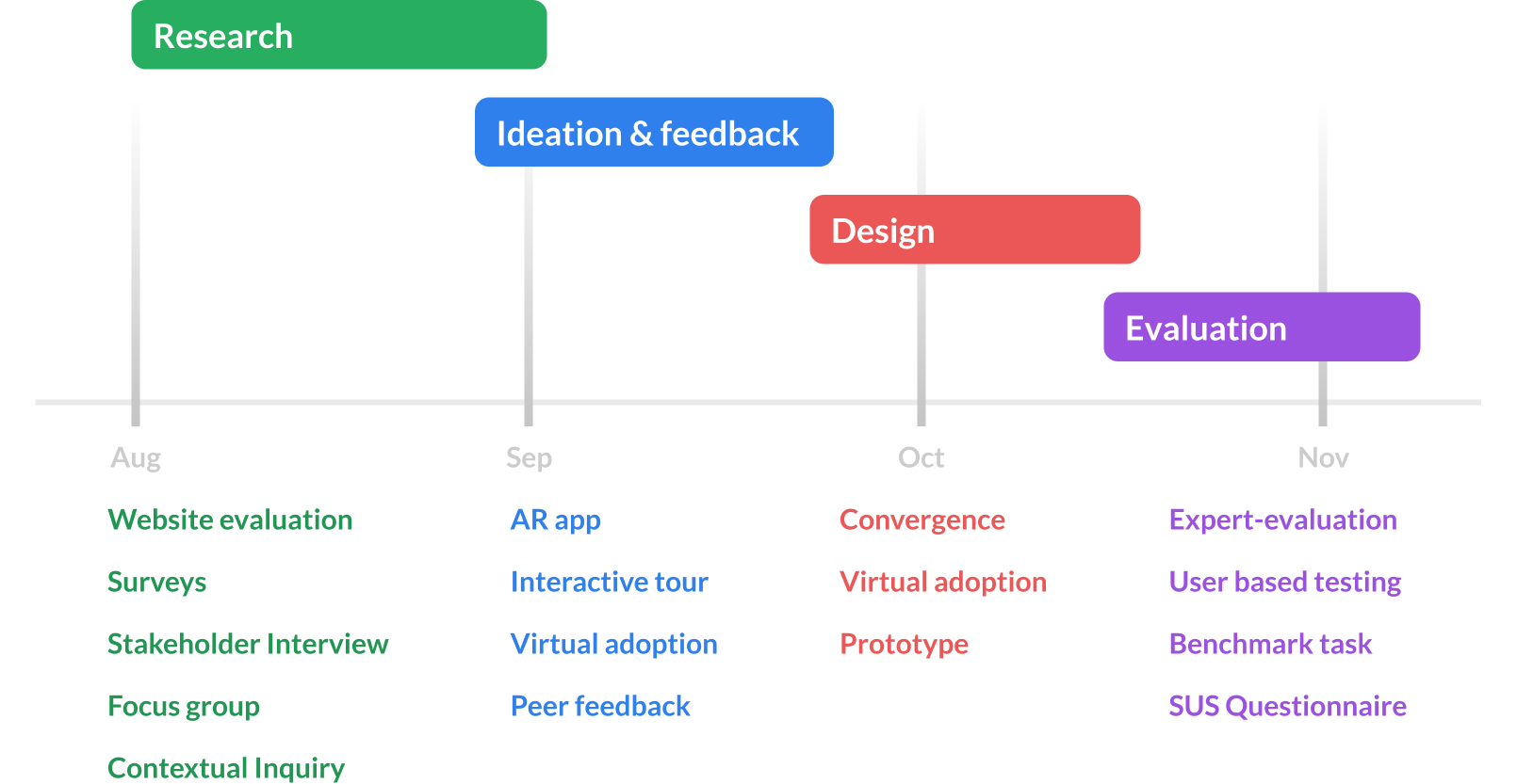
The project started with research activites, followed by divergence phase where we sketched 3 ideas and got feedback from our peers. Following that, we converged strong points of each idea into one single design and concluded with evaluation of the interface.
Phase 1
Research
Website Evaluation
Zoo’s website communicated conservation through wordy articles. Thus, failed to engage millennials.
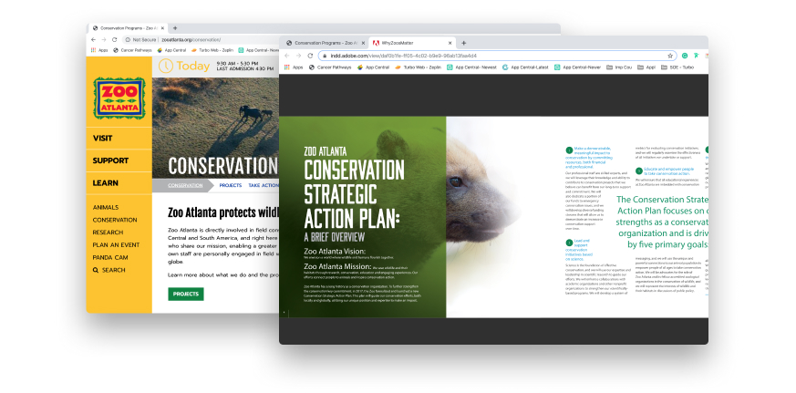
![]() We validated this from the website visits data. Majority visitors who were millenials, never visited the conservation section.
We validated this from the website visits data. Majority visitors who were millenials, never visited the conservation section.
Field Visit
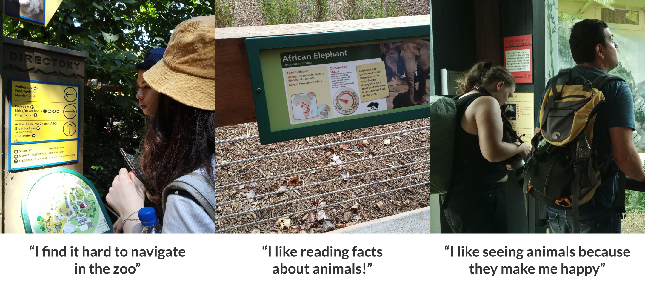
We visited Zoo-Atlanta to see how adults engaged with conservation messaging at the zoo.

![]() We observed that nobody was reading the conservation signs. People were passing by the signs but only few stopped to take a glance.
We observed that nobody was reading the conservation signs. People were passing by the signs but only few stopped to take a glance.
Survey
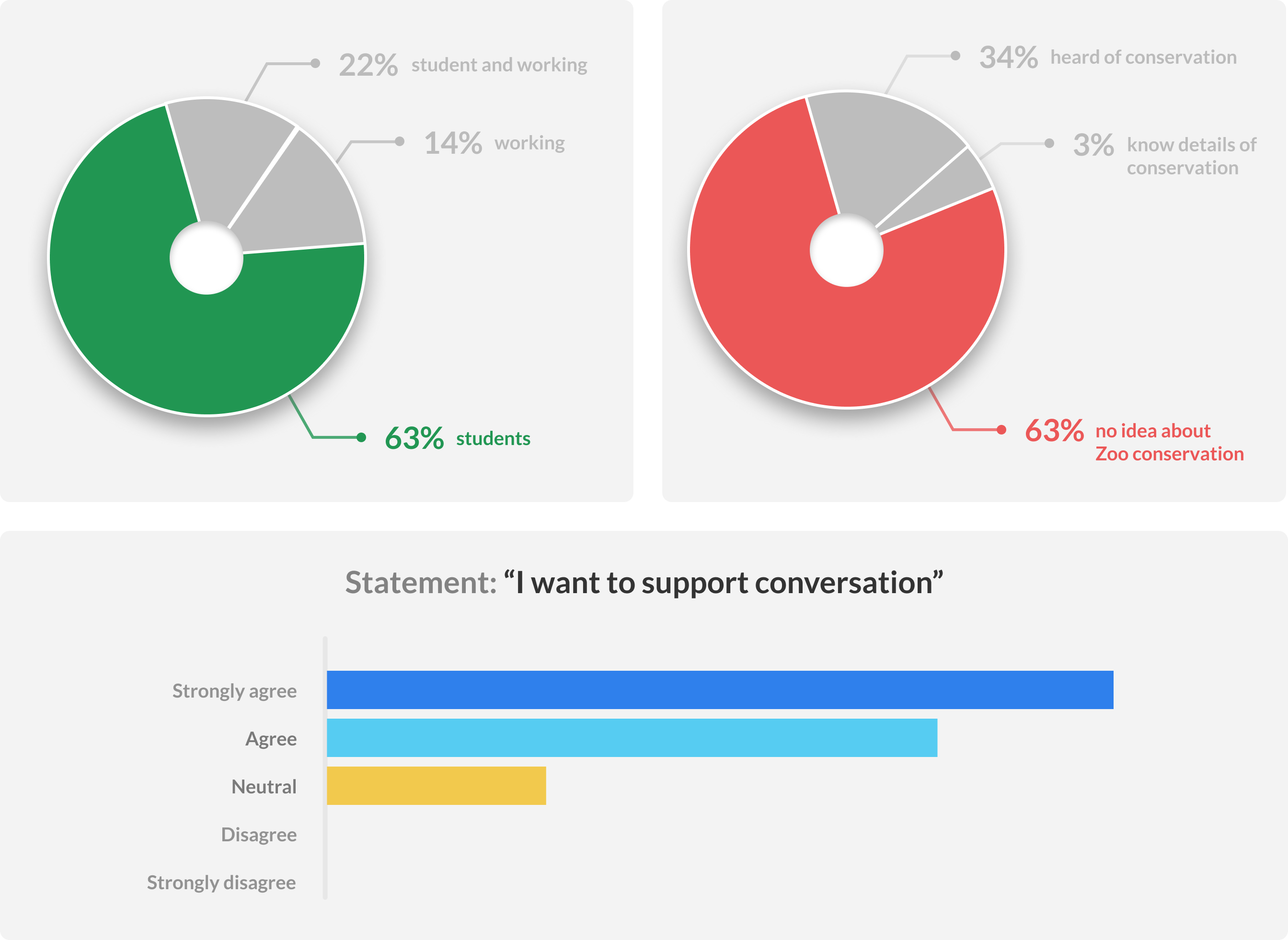
We sent out open survey to understand awareness about zoo's conservation mission. It received 41 responses.
"I feel like there's nothing really "new" about going to a zoo. I also find that zoos tend to be catered more toward kids and families."
![]() People don’t consider zoo as a hangout place. We need to bring the information to them rather than expecting them to come to the zoo.
People don’t consider zoo as a hangout place. We need to bring the information to them rather than expecting them to come to the zoo.
Contextual Inquiry
We conducted a zoo walkthrough with a bunch of Georgia Tech students.
![]() How can we make conservation messaging a part of zoo experience? Animal lovers like to know more while at the zoo.
How can we make conservation messaging a part of zoo experience? Animal lovers like to know more while at the zoo.
Focus Groups
After the zoo visit we conducted focus group interviews to learn more.
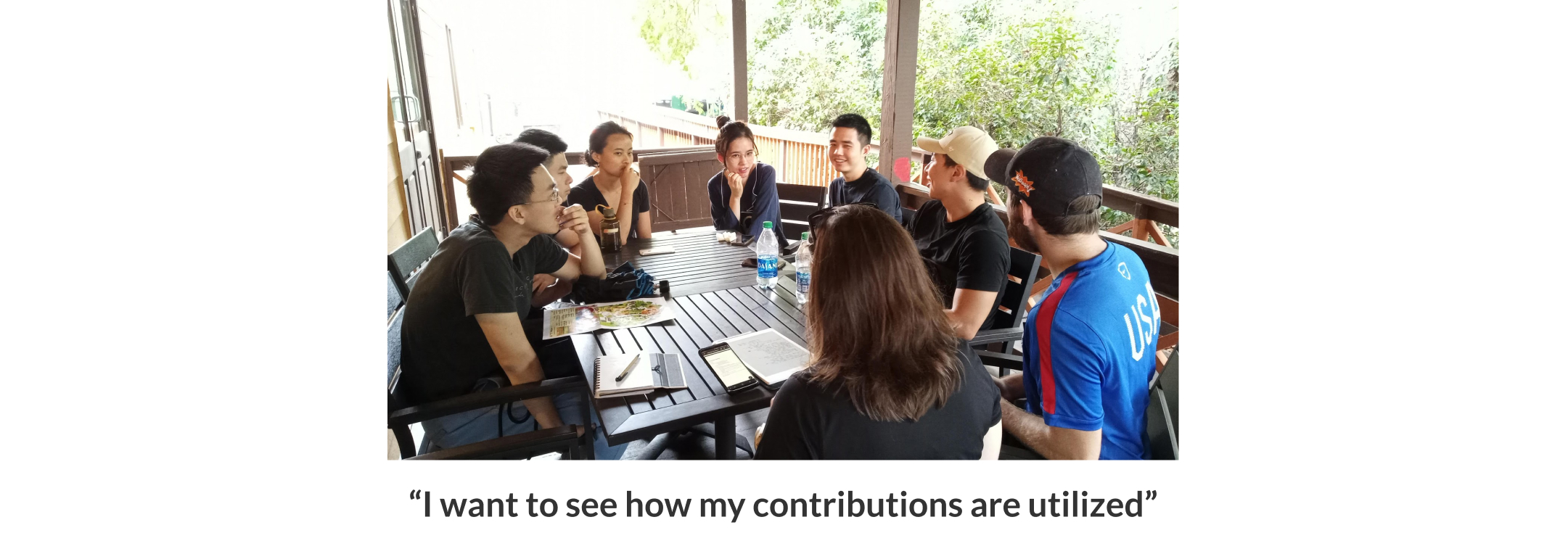
![]() People are interested to contribute, but they want to know how and where their money is utilized.
People are interested to contribute, but they want to know how and where their money is utilized.
Distilling Insights
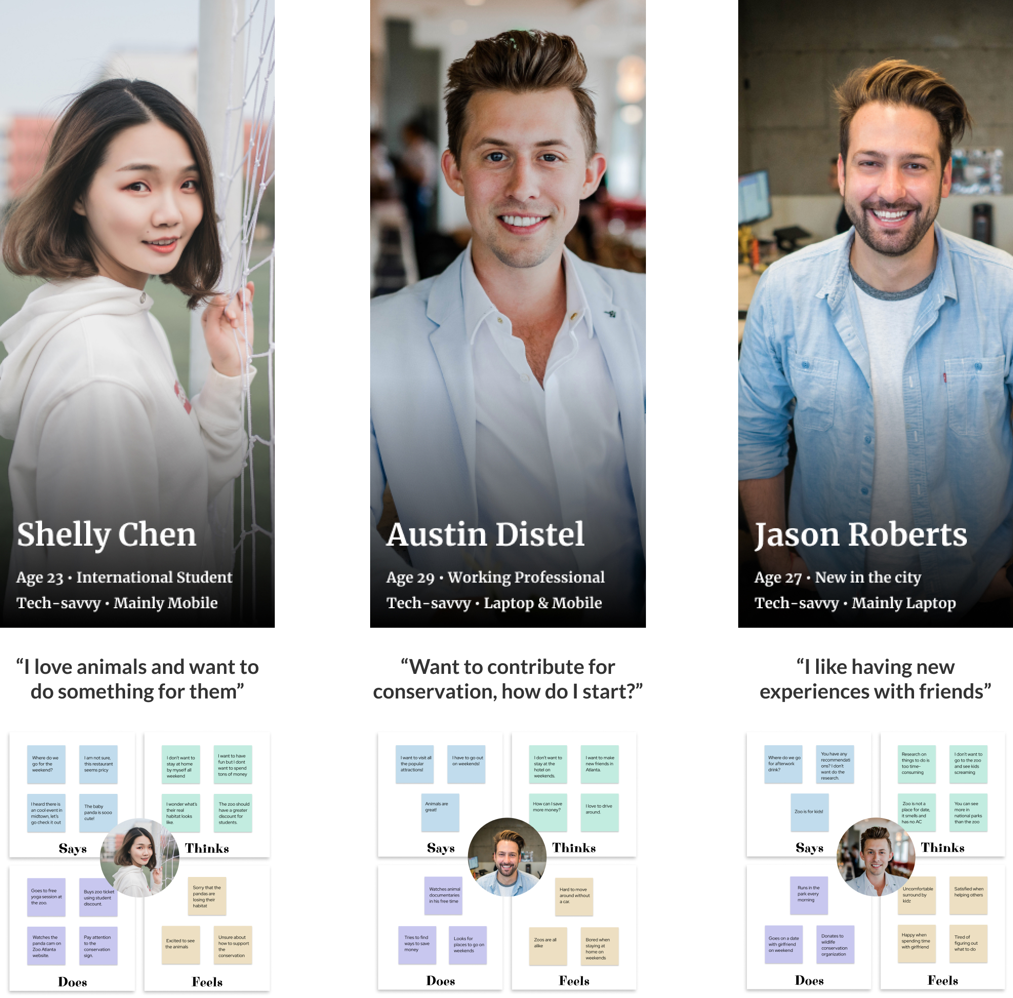
After research, we came up 3 distinct personas for our users.
Phase 2
Divergence and feedback
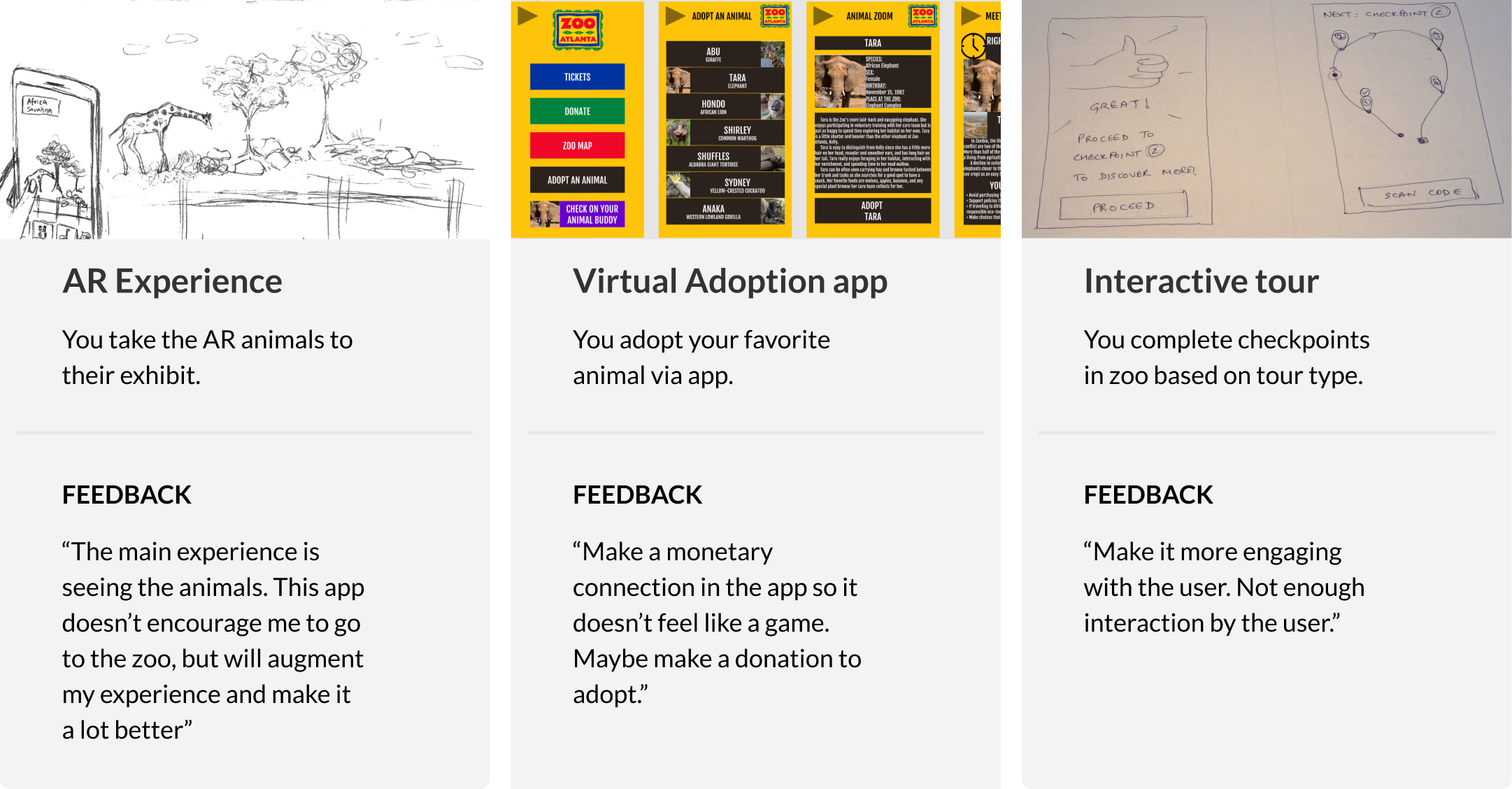
We came up 3 distinct ideas for the the design. We storyboarded scenarios to get feedback from our peers and stakeholders.
A smartphone because of it's ubiquitous availability was a useful technology to deliver tailored conservation information to the millenials.
- Our first approach, was to have an Pokemon Gó like AR experience where a person has to take an animal to it's exhibit. Once he reaches an exhibit, the animal cartoon will educate them about animals and conservation efforts by the zoo.
- Our second approach, was to have an animal adoption app where people can virtually adopt their favorite animal with a tap. They'll periodically receive information about animal's whereabouts and zoo's conservation efforts.
- Our third approach, was to provide a customizable guided map-based tour to visitors. And once they reach a milestone, they will get notification with information about the exhibit and zoo's conservation efforts.
Getting early feedback
Based on feedback from 5 peers, we found that in first and third approach, they felt like technology is overly hampering their zoo-viewing experience. But they liked certain elements, like the guided experience because zoo's can be large and confusing. We decided to retain the guided visit element from both the experiences.
They had positive views about the virtual adoption idea because they felt an emotional connection with the adopted animal and they didn't have to go to the zoo to get the conservation information. However, they also said, adopting an animal with a single tap felt "unreal" and there needs to be an element of authenticity to the process.
And so, we decided to add a small monetary donation step to the flow to make it more feel more "real".
Phase 3: Convergence
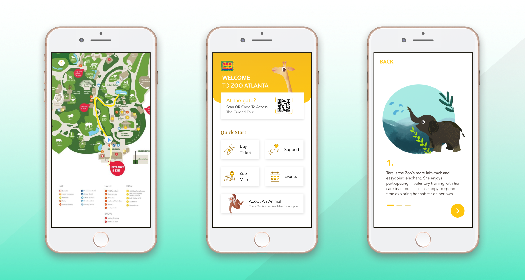
Introducing the Zoo-Atlanta app
Adopt animals virtually. Receive custom notifications to see how your donations are make difference. At the zoo, adopted animal becomes your guide, tells you facts about his animal friends as you go about exploring the zoo.
30 seconds Intro video
The Design
Engaging millenials emotionally
We connect with millenials through a story. Story briefly talks about animal's persona and his life at the zoo and zoo's conservation efforts.
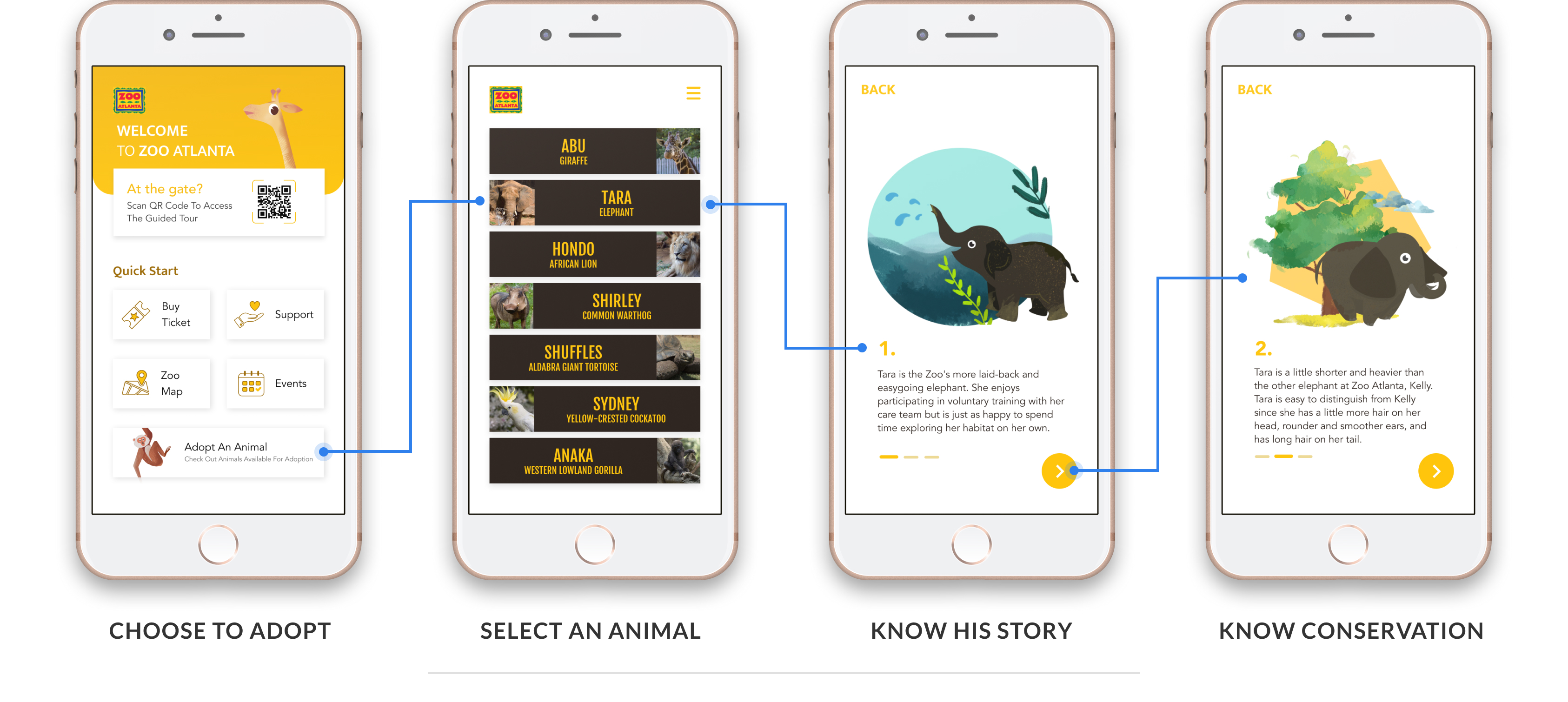
Users can adopt animals by learning their story
Making donations transparent
Users have full control over the donation amount towards adoption. They can choose conservation activity to contribute to and frequency of donation.
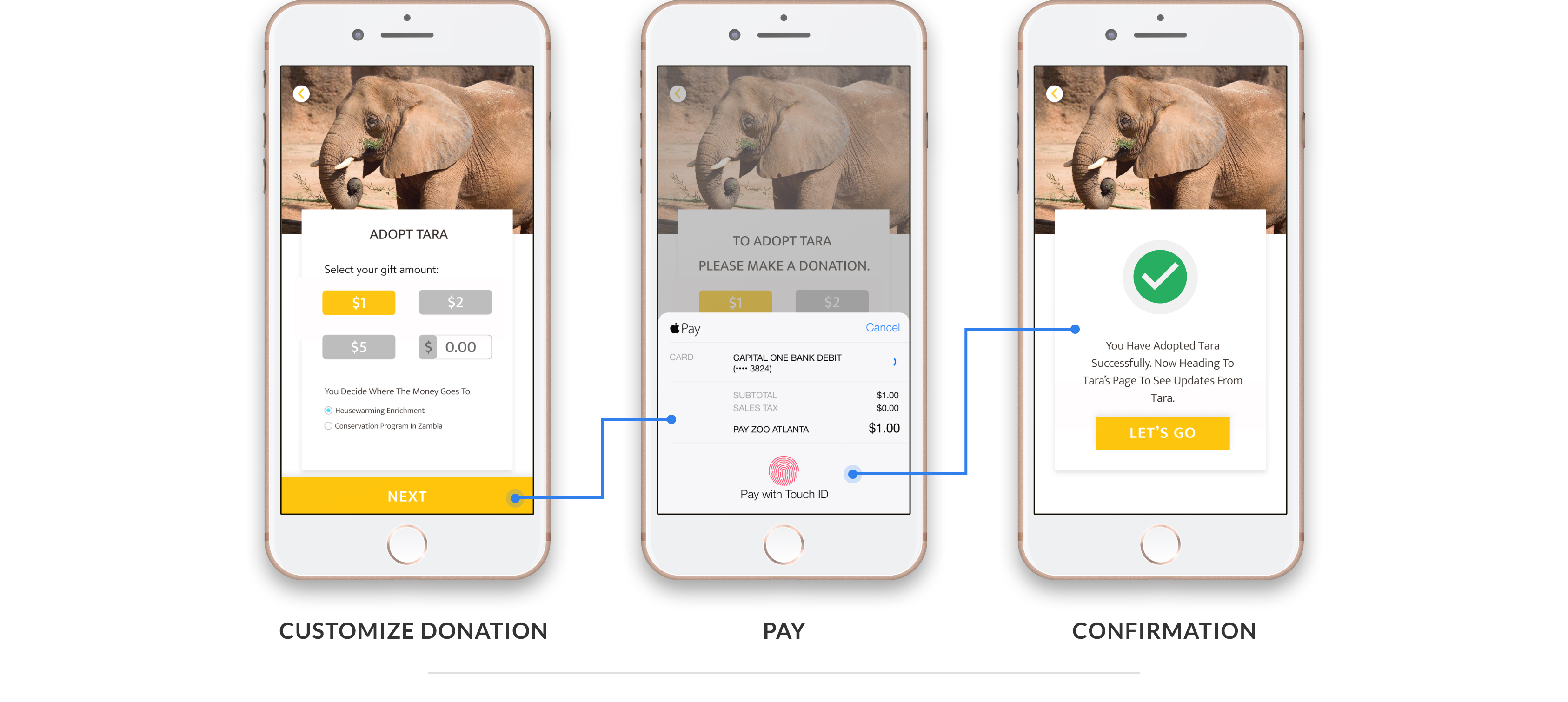
Users have full transparency control over their money.
Conservation at it's heart
Based on their adopted animal, users get personalised updates and zoo's conservation activities. They can easily share news on social media.
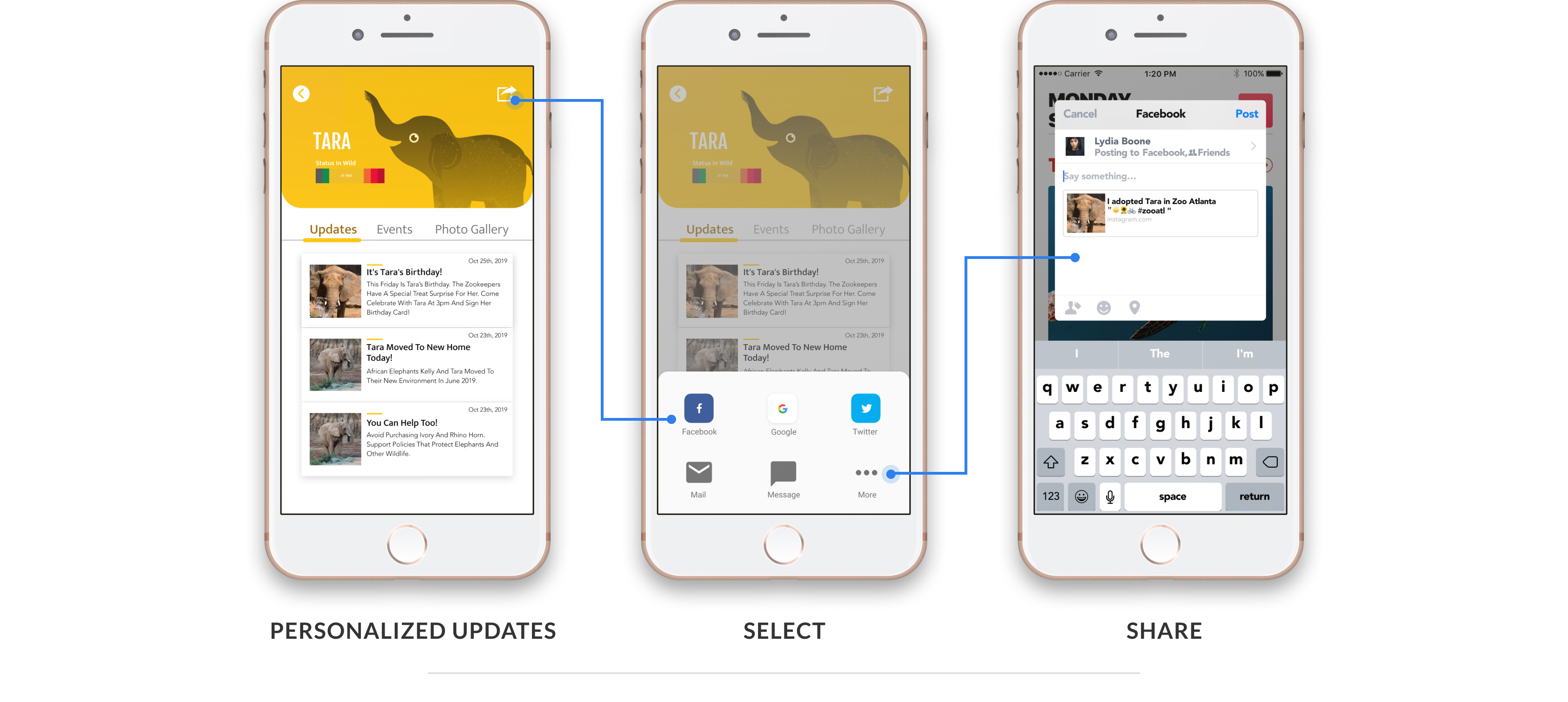
Personalised updates about adopted animal and zoo's conservation activities.
Zoo visit, a seamless experience
Users are motivated to see adopted animal. At the zoo, the adopted animal's chatbot guides them using interactive map and tells them fun facts and stories.
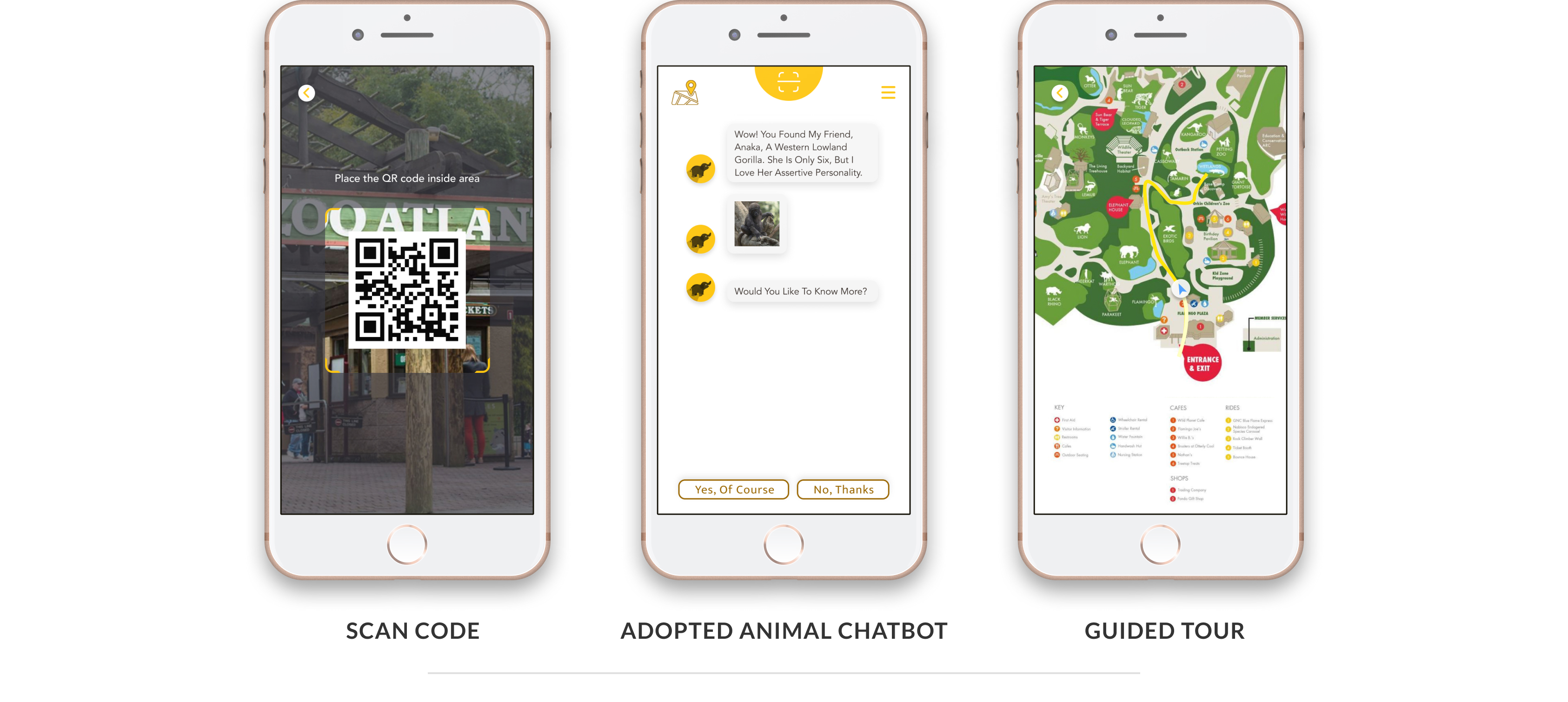
Scanning QR code activates virtual chatbot of your adopted animal.
Phase 4
Evaluation
We conducted expert-based and user-based evaluation with the app prototype to identify usability issues in the app interface. We used cognitive walkthrough with the experts and benchmark tasks with the users.
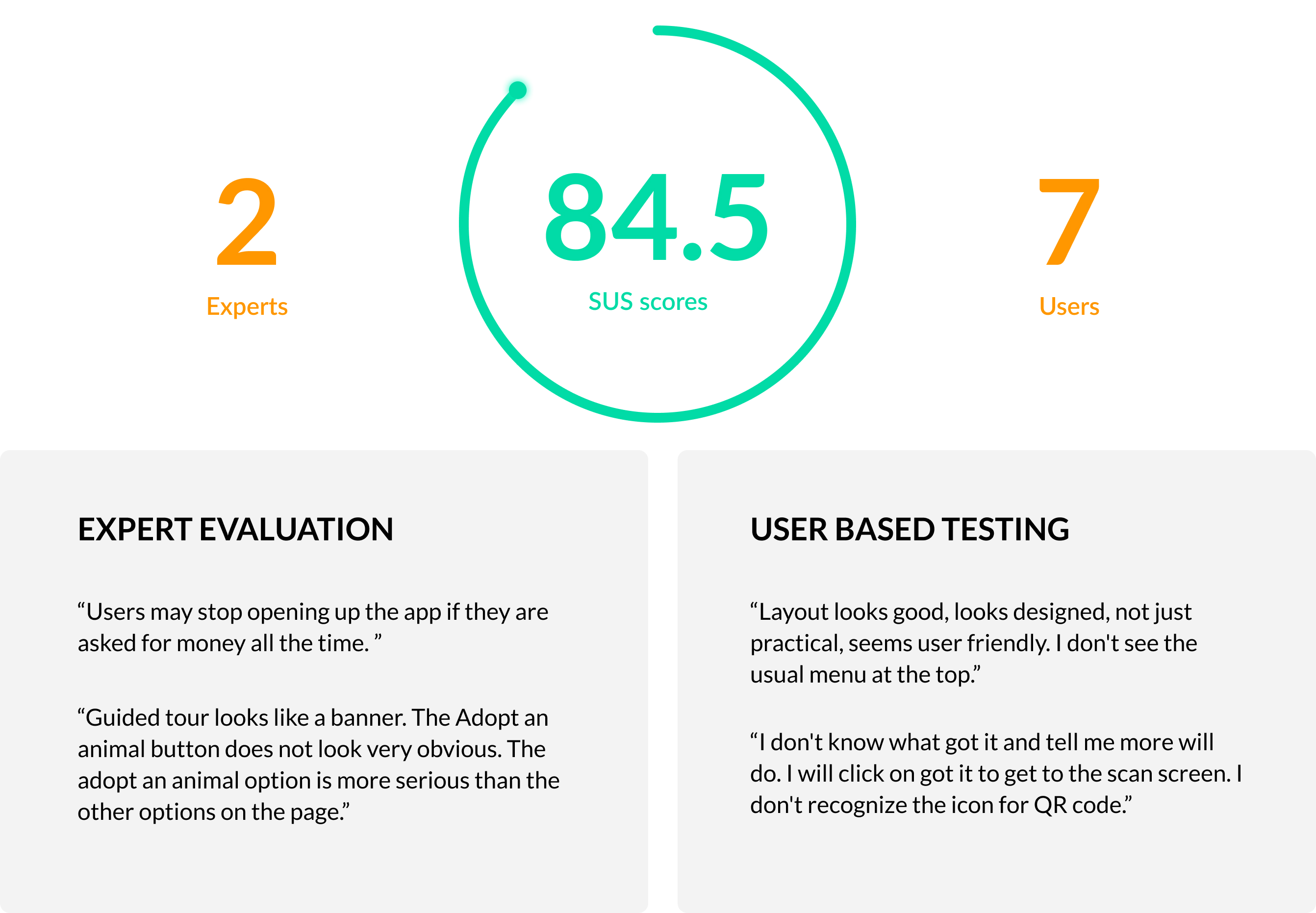
We were able to discover some usability issues through this process. However, the feedback for the overall design was staggering.
What we accomplished and next steps...
From our evaluation, we validated that this app successfully encourages millenials to learn about conservation by meaningfully engaging them.
Zoo-Atlanta plans to use this prototype to guide the design of their commercial app.We hope our work will help them reach millenials effectively and take conservation mission forward.
What I learnt
- Get feedback early and often: During divergence phase, all team members were leaning towards the idea of AR experience because we thought it was "cool". However, when we took feedback from peers, their reaction was totally opposite! They didn't like it because it interfered with their zoo-visit experience. This made me understand the importance of taking feedback early and often during the design process.
- Diverse teams produce superior output: In our project team, all members had different backgrounds. Psychology, Industrial design, Stats, Software development. I initially expected that the difference of backgrounds will produce friction which will diminish the output quality. However, to my surprise, collaboration brought in diverse view-points which ultimately enhanced the output! Now, I'd prefer working in team with people from diverse backgrounds.
- Documenting process helps in long run: Before this project, I was never a big fan of documentation. But we were required to submit a report each month regarding our progress as a deliverable in this project. In retrospect, I realise it's importance. It not only helped me reflect on my experiences later but also allowed me to share my insights more easily with others.